Cattail.Nu Watercolor Course
Become a Master
Lesson 1: Getting Started
Overview
This lesson will help you assemble and become familiar with your watercolor supplies. At the end of the lesson, you should understand your paint properties and have a feel for how they work both individually and together. You may already know much of the information here, but it's worth going through to look for things you may have missed in your journey. It will also give you an introduction to the format of the lessons and what to expect in later lessons.
Philosophy
Every master artist started as a beginner and had to learn about the tools and gain experience using them.
Supplies Needed for This Lesson
- Watercolor paper
- Watercolor paints
- Watercolor brushes
- Palette
- Black marker (Sharpie, Prismacolor)
- Black Pen capable of writing on watercolor paper
- Red Pen capable of writing on watercolor paper
Read through the entire lesson before making any purchases.
This part of this lesson has some basic information about your supplies and some tips for using them. Feel free to just scan through it and see if there is anything of interest to you and move on to the exercises in the next part.
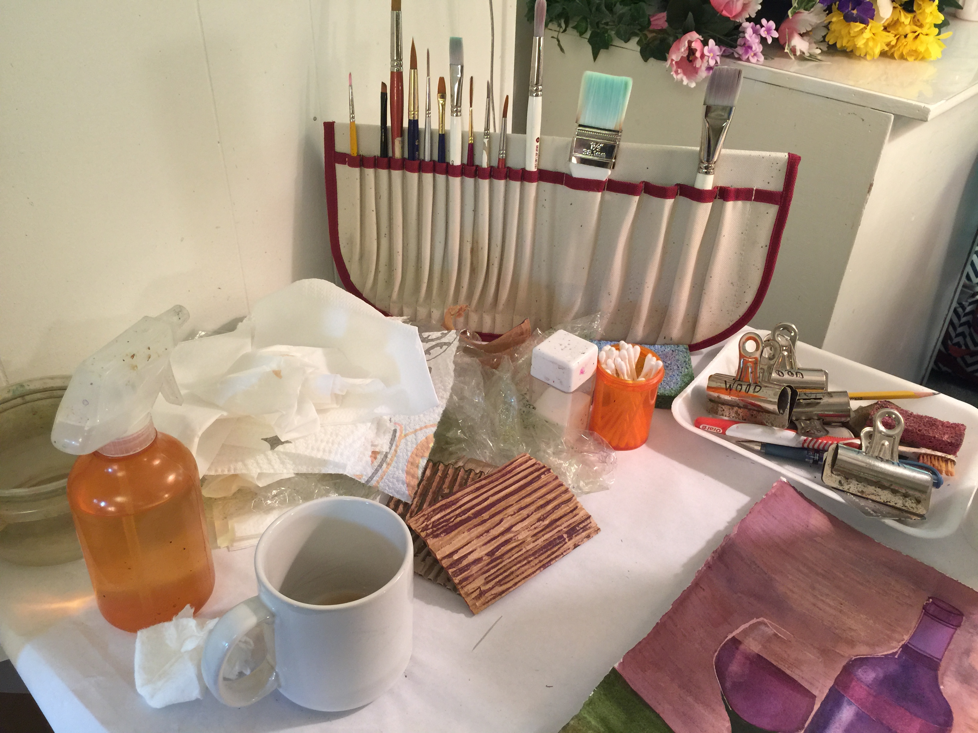
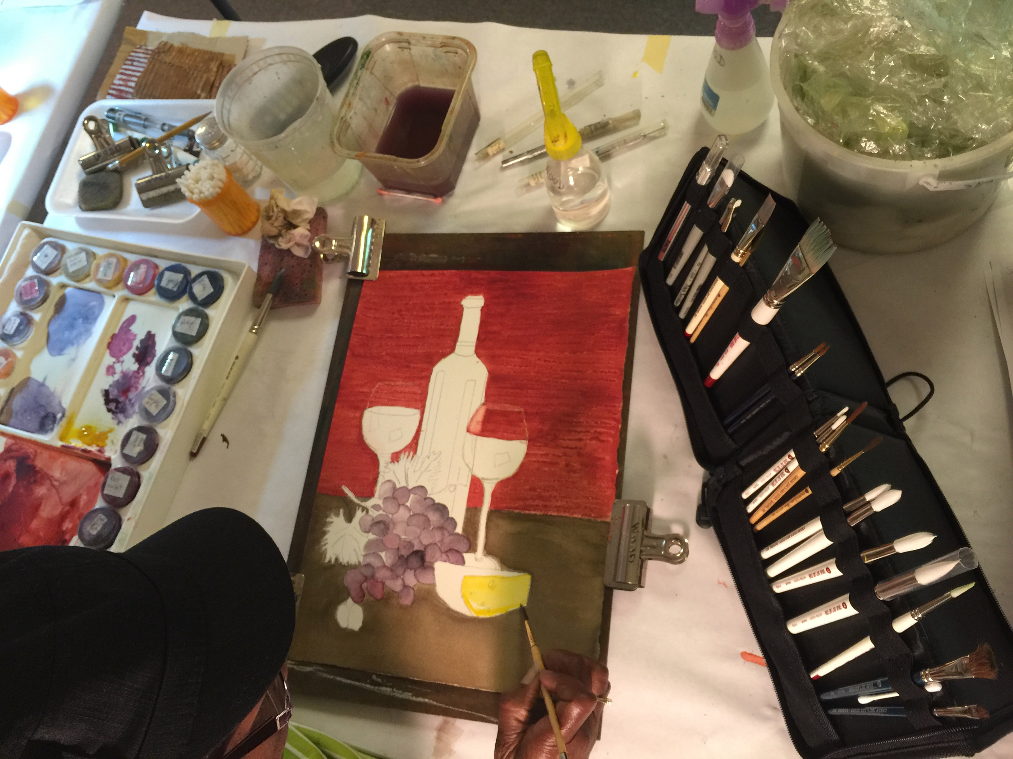
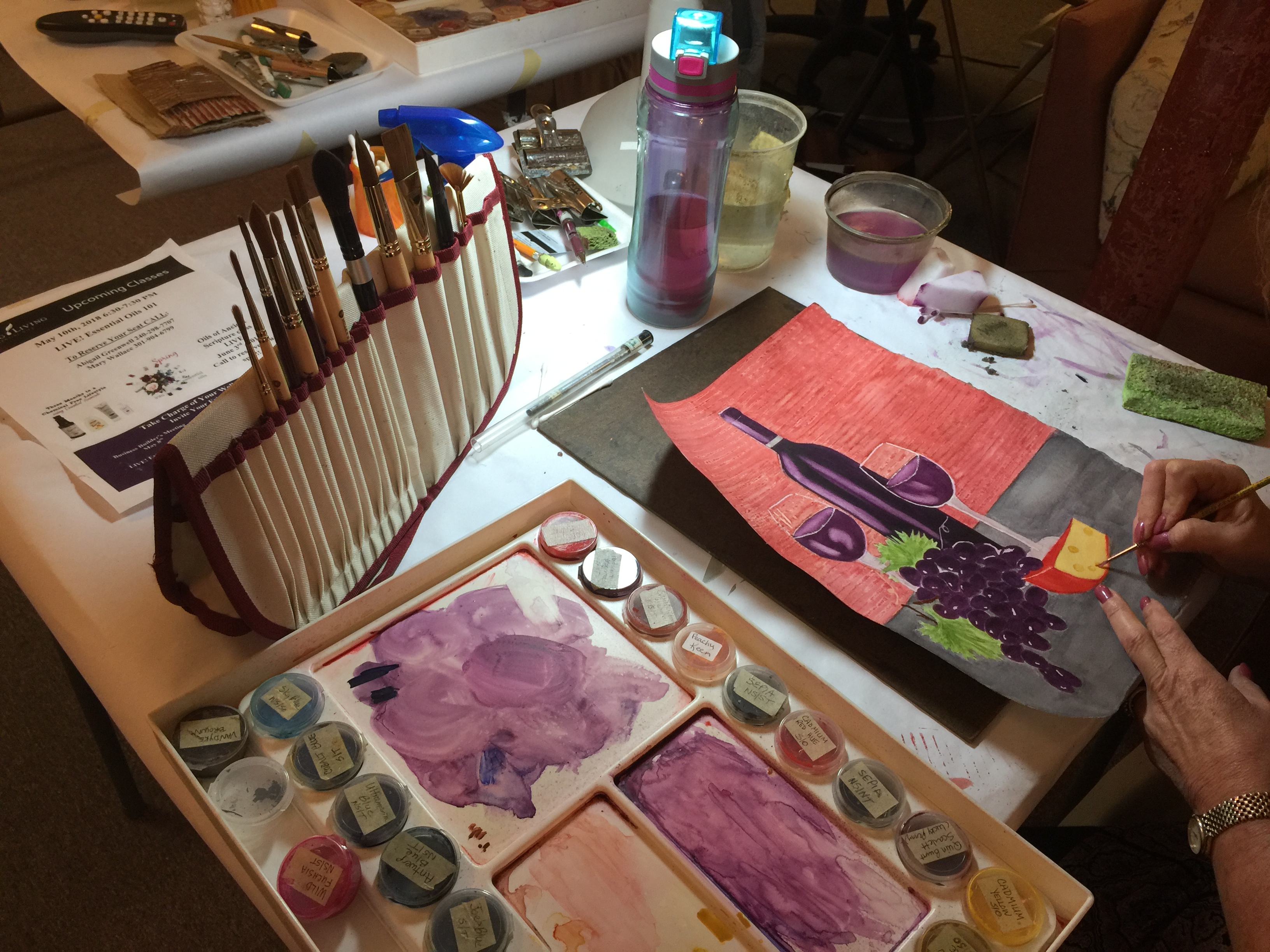
General Workspace
Be consistent in paper, water, paint, and brush arrangement. This will build muscle memory and allow you to focus on your painting not on where you need to rinse your brush or where to find that special color you are seeking.
You need 2 water containers - one for rinsing brushes that have paint in them and one for clean water. Rinse a dirty brush in the rinsing water, wipe it on your hand towel (or sponge or paper towel or whatever) to make sure it is clean, swish in the clean water, and then move to pick up color or wipe it on your hand towel to get the right moisture level for painting/lifting.
Your rinsing water should always be on the same side of your clean water every time you paint. Do not set your coffee cup or your wine glass next to your watercolor water.
You will need space to be able to tilt your working board from flat to about 45 degrees, depending on what you are trying to accomplish. Flat washes should always be done on an angle. Detail work that would get ruined if it dripped downward should be done flat or only at a very slight tilt.
Temperature affects drying time of both your painting and the paints in and on your palette. The warmer it is, the faster things will dry. This can be useful and frustrating, depending on what you are trying to accomplish. You'll have to gain experience to decide what temperature you most like working at.
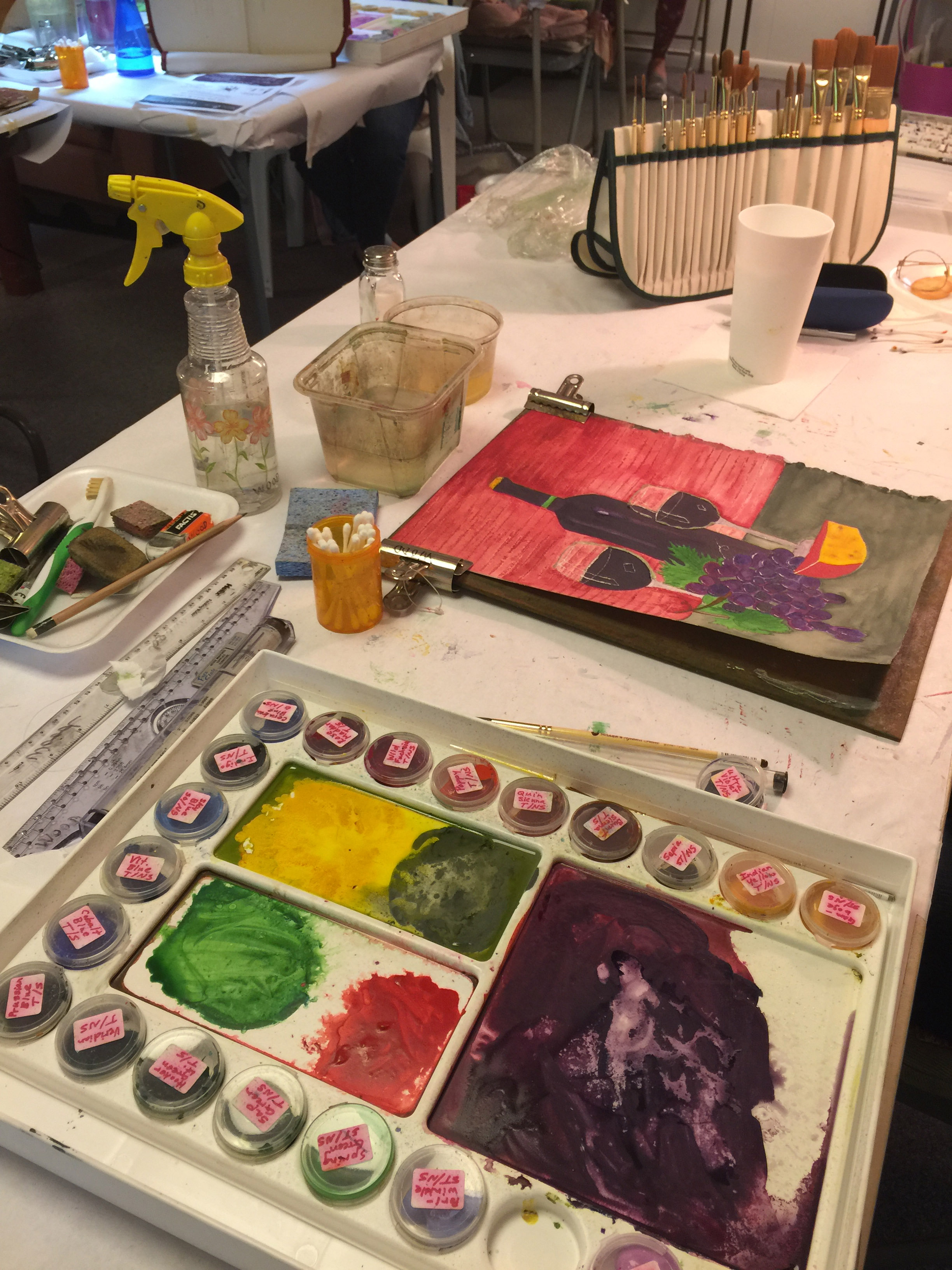
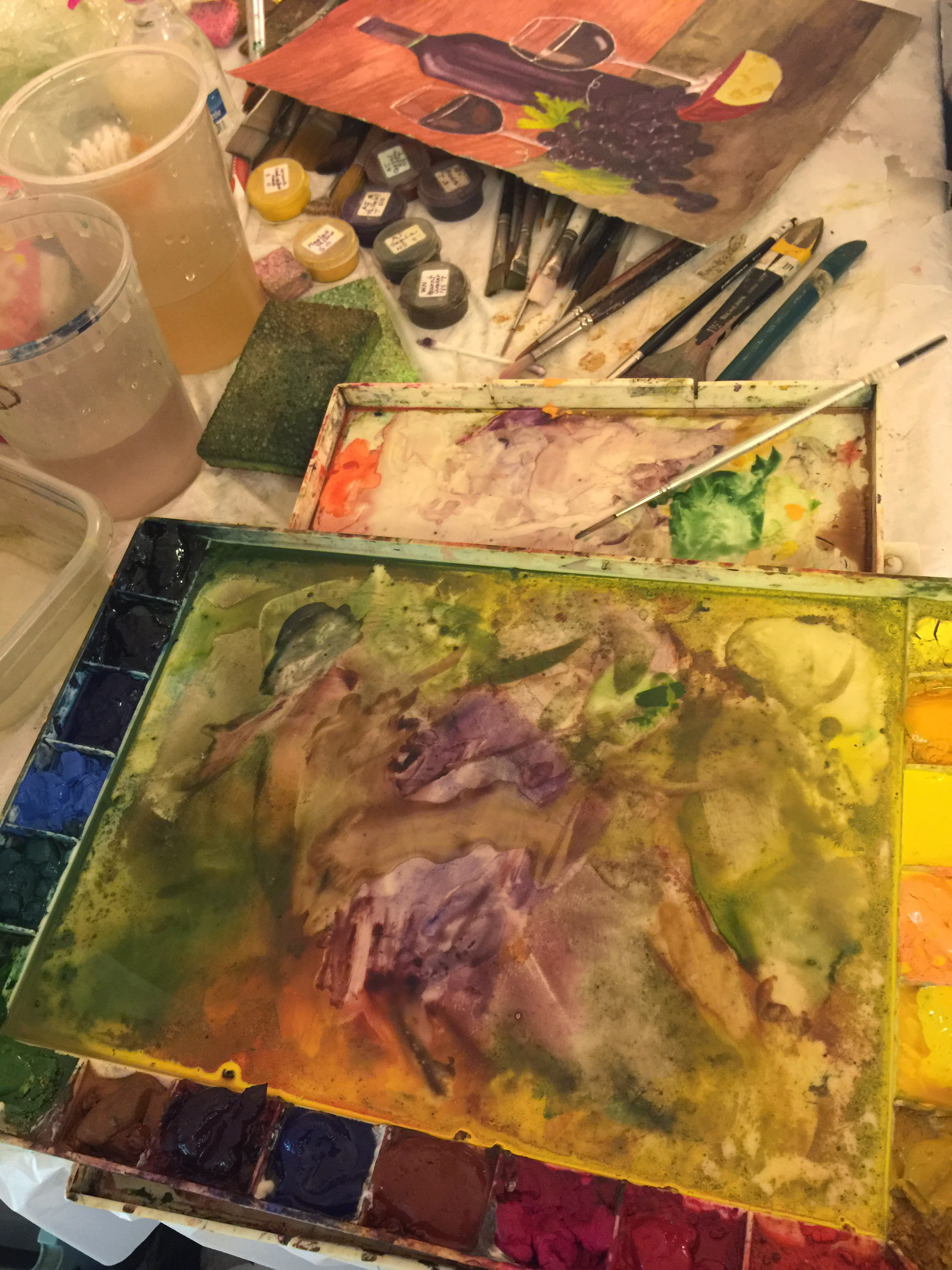
Palette
New Palettes
It's recommended for some new palettes (including the John Pike palette) that you take the scrubby-side of a dish sponge and give the work area a bit of a scrub to very lightly roughen the surface. That allows the paint to stay on the work area where you put it, even when the palette is slightly tilted.
If you haven't already filled your palette with colors, organize your palette into cool colors and warm colors (basically, follow the rainbow).
Cool colors: purples, blues, greens
Warm colors: yellows, oranges, reds
Label each well's paint color on the side either with masking tape + Sharpie. If your wells are removable/interchangeable, you can write directly on it with a Sharpie. That will help you know what to refill it with.
Put a nice glob of paint in the back of the well. Don't overfill your well. Leave some area for you to add water and swish the paint around in the front.
Using your Palette
Paints will dry and harden in your palette - that's expected. Spray or wet the dried colors and let it soak and become gooey as you set up the rest of your workspace.
Less expensive paints may crack and break apart and make a mess. You might be able to counter this by adding some gum arabic to your paints, but this is one of the reasons I recommend professional tube paints.
If you are frequently painting, you can keep your paints moist by storing a damp sponge in your palette when you close it.
Do not leave your palette open and uncovered when you aren't using it. Dust and other debris (Cat!!! You left your hair in my paint AGAIN!!!) can get in the paint, and light can damage the pigment.
Some people will tell you to clean your palette's work area every session while others will say to clean it only when you are starting a new project. You'll have to decide what works best for you.
Paint
Watercolor paint is ground up tiny bits of something that is colorful mixed with some sticky solution to hold it together as well as to the paper and some other liquid to allow it to mix and flow when added to water. It may also have chalk in it or some other thickening medium. Professional paints tend to have more pigment to carrier and quality binders, while student grade paints have more fillers and might use cheap binders. You can actually purchase powdered pigments, add your own base solution, and make your own paint. Most of the pigments should not be inhaled, so there's some hazard if you do that.
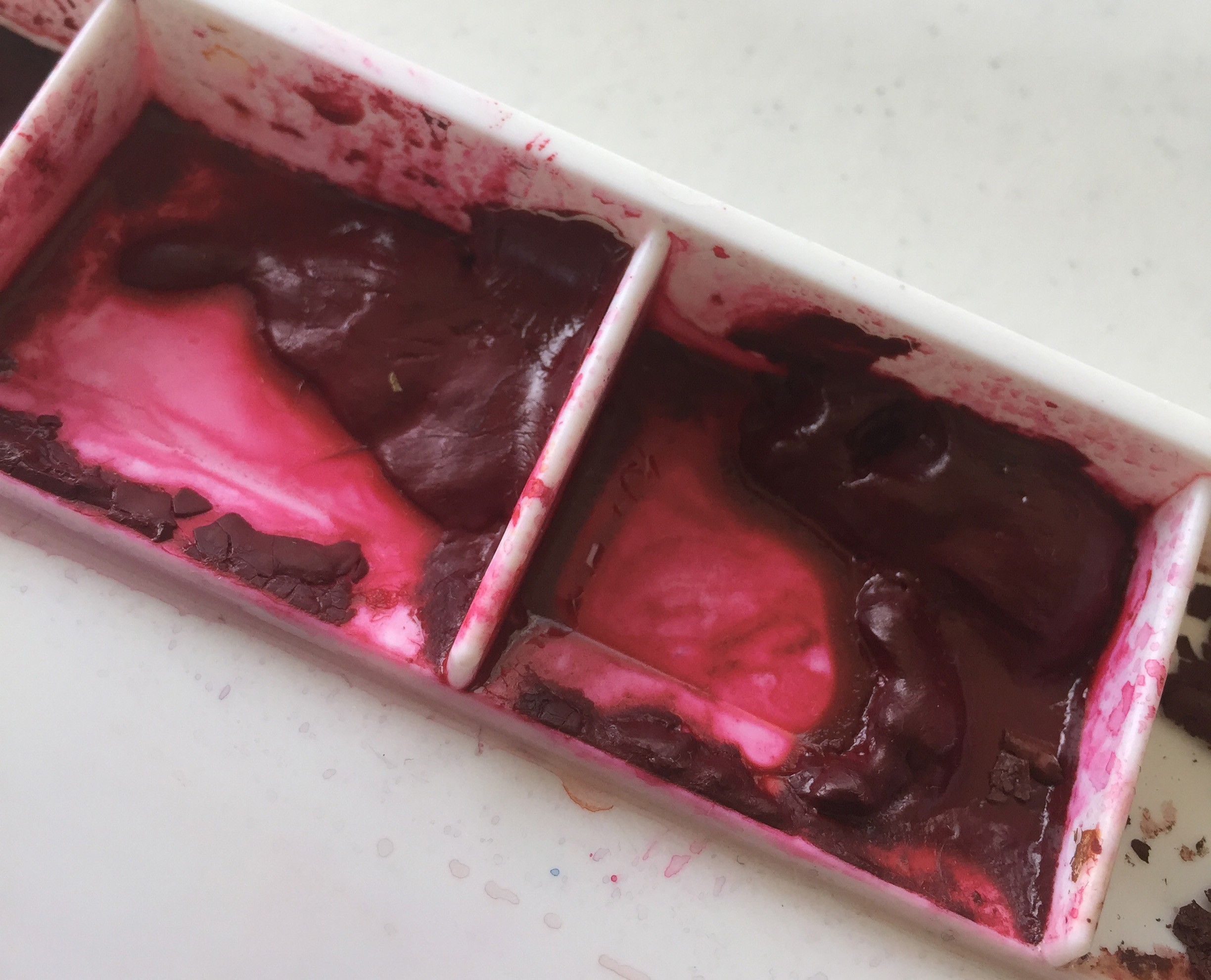
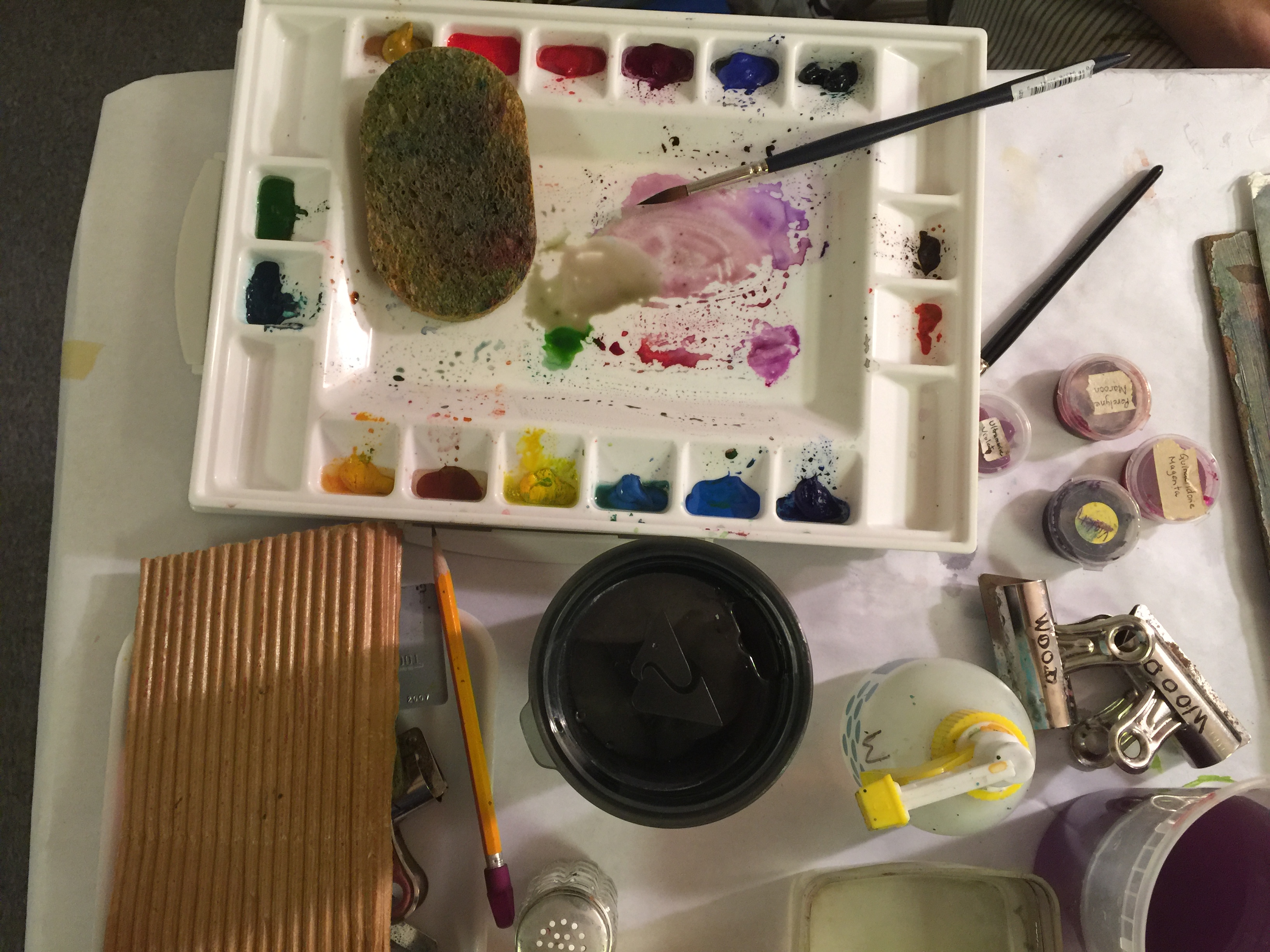
Your paints in your palette should be nice and gooey (on the surface of the mound) when you work with them. This lets you easily transfer color from the well to the work area where you add water to make it the consistency you want for painting. If you have to scrub at the paint to get more of it, you need to either add more water or let the water sit on it a little longer until it is gooey. You can add water with your brush, a spray bottle, straw or a pipette, and experience will teach you how much you need to add for your particular paints and painting style.
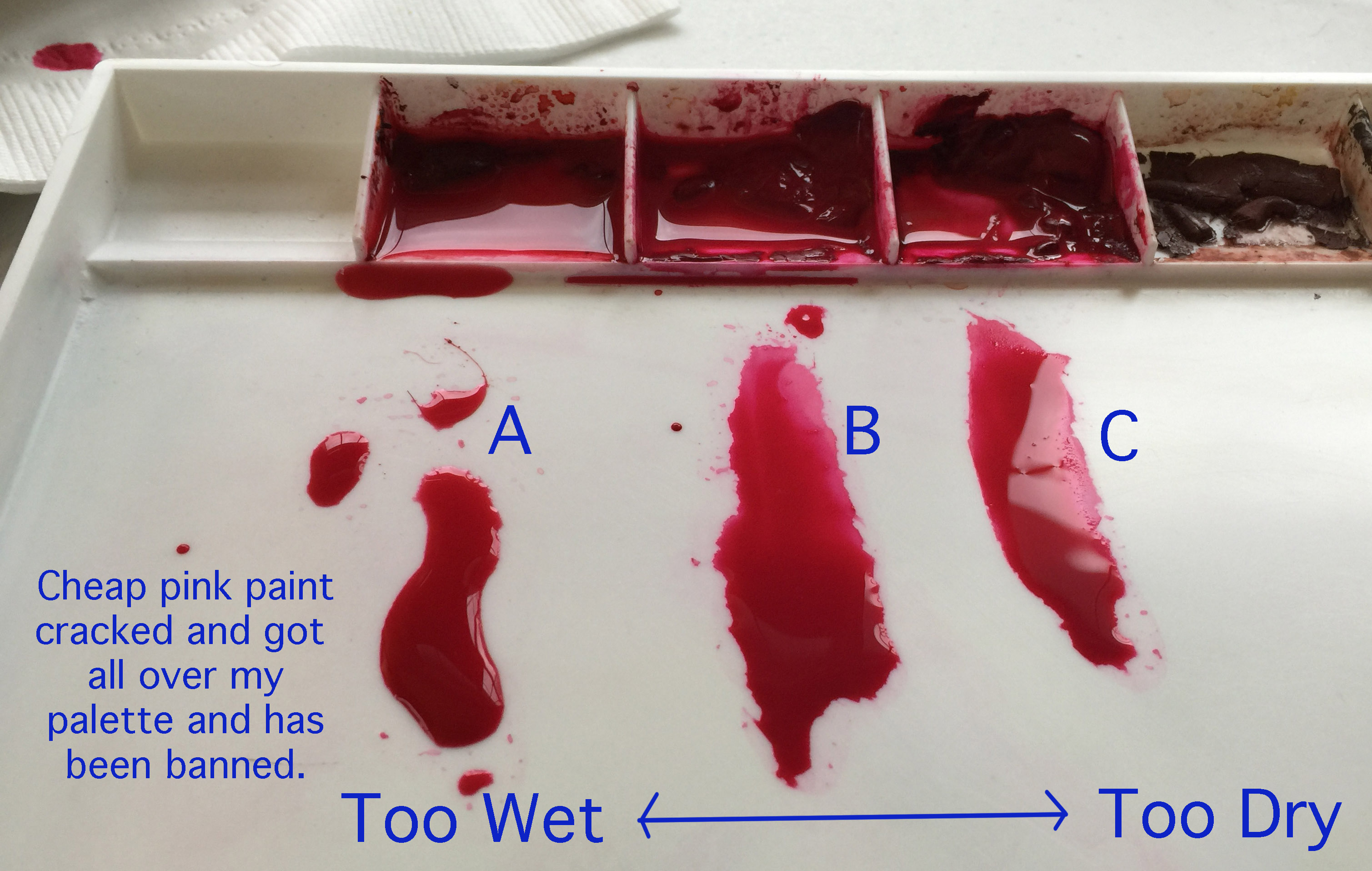
In the picture, there's not much difference between the three puddles in the work area. 'A' has a bit too much water, but you might want a lot of a light color with a "darker too-wet area dried paint edge". 'B' and 'C' will both work nicely, but notice that picking up more of 'C' will be challenging and require some scrubbing because the mound's surface isn't gooey, just mildly damp. The well on the far right hasn't been wet at all and is pretty old with unused paint that has cracked. As it's a professional paint from a tube, it could be rewet, mushed around, and dry perfectly useable again, although some might want to cut their loses, clean it out, and add fresh paint.
Paper
Paper is basically a flat sponge made out of tiny bits of wood or plant pulp that has been pressed together. When water is put on paper, it sinks into the spaces between the fibers, absorbs into the fibers, and sits on top of the fibers. If more water goes on the paper than the paper is designed to hold, it will buckle and wrinkle, expanding where it is too wet. If the paper isn't designed to be wet, it might fall apart when water is added.
Watercolor paper is designed specifically to hold water and not fall apart. Depending on the paper, the water and paint might sink in or just sit on the surface. Paint may flow across the surface easily or it may sit in place. The surface of the papers will have different textures. It varies a lot from brand to brand and from type to type within a brand. It takes some experimentation to find what you like best.
Stretching Sheet Paper (not block)
Stretching paper is apparently only done by the super-enthusiastic and is supposed to prevent your paper from buckling when you paint on it. I did it once, and it made a mess, took forever, and I didn't see much benefit. Haven't done it since. Stretching your paper involves soaking your paper until it fully expands, then securing it so it cannot possibly shrink back again, and letting it dry. There's some YouTube videos of people doing it; search for 'watercolor stretching paper'. I won't object if you want to, but you don't need to for this course.
Taping Sheet Paper (not block)
If you don't want to work with your paper by just holding it in place with your hand, you can secure your paper to your work area (moveable board that can be tilted) with bulldog clips (the large flat clips listed in the supply section), or you can tape it. Bulldog clips are reusable. I find they get in my way while painting, but are great for transferring your design (which we'll get to in a later lesson).
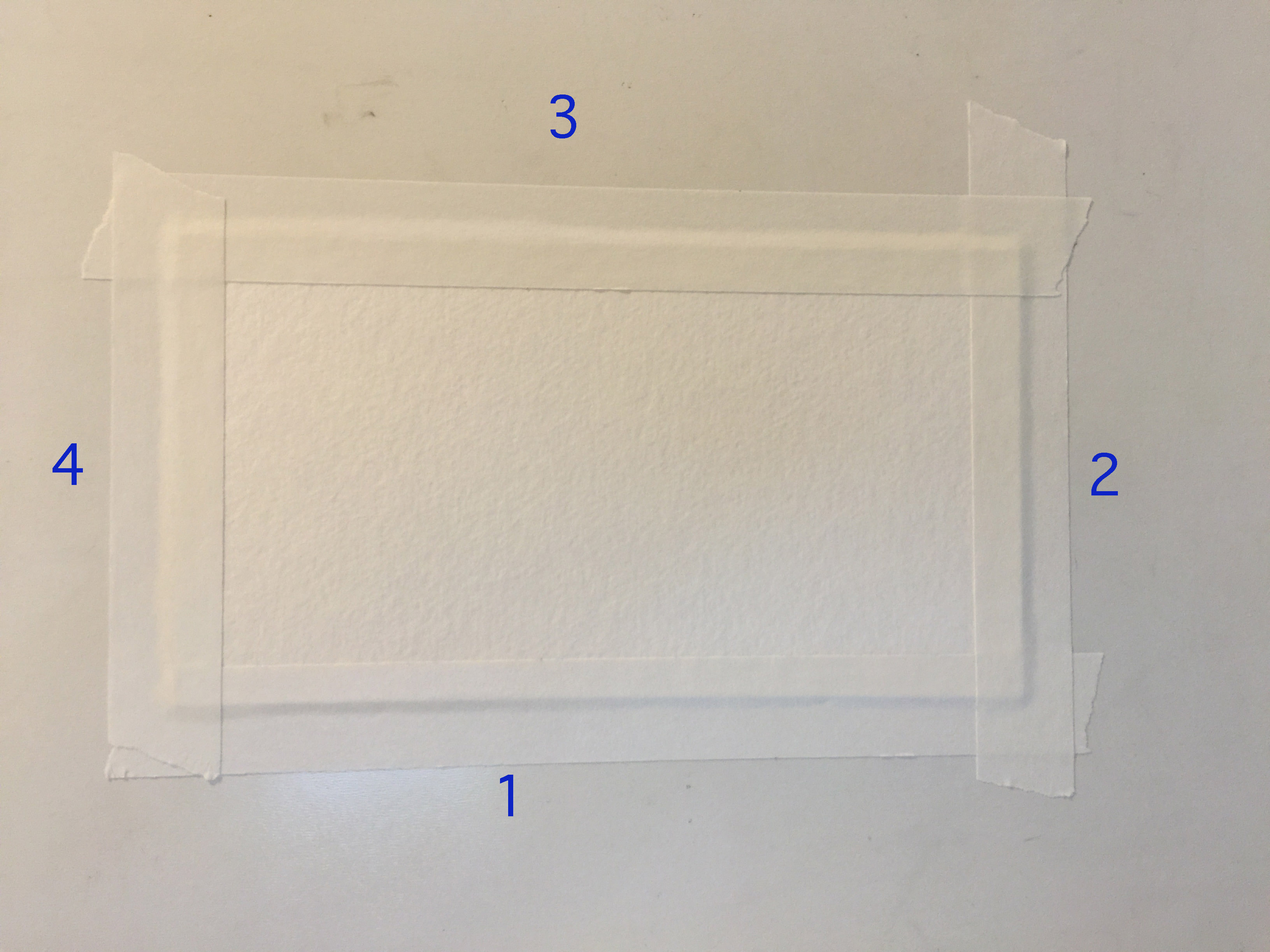
Taped down paper. Notice tape covers all of the edges.
Use white artist tape which is similar to masking tape in that it comes off very easily without damaging the paper. Do not use colored tapes (like the blue artist tape) as these will make it too difficult to judge colors in your painting.
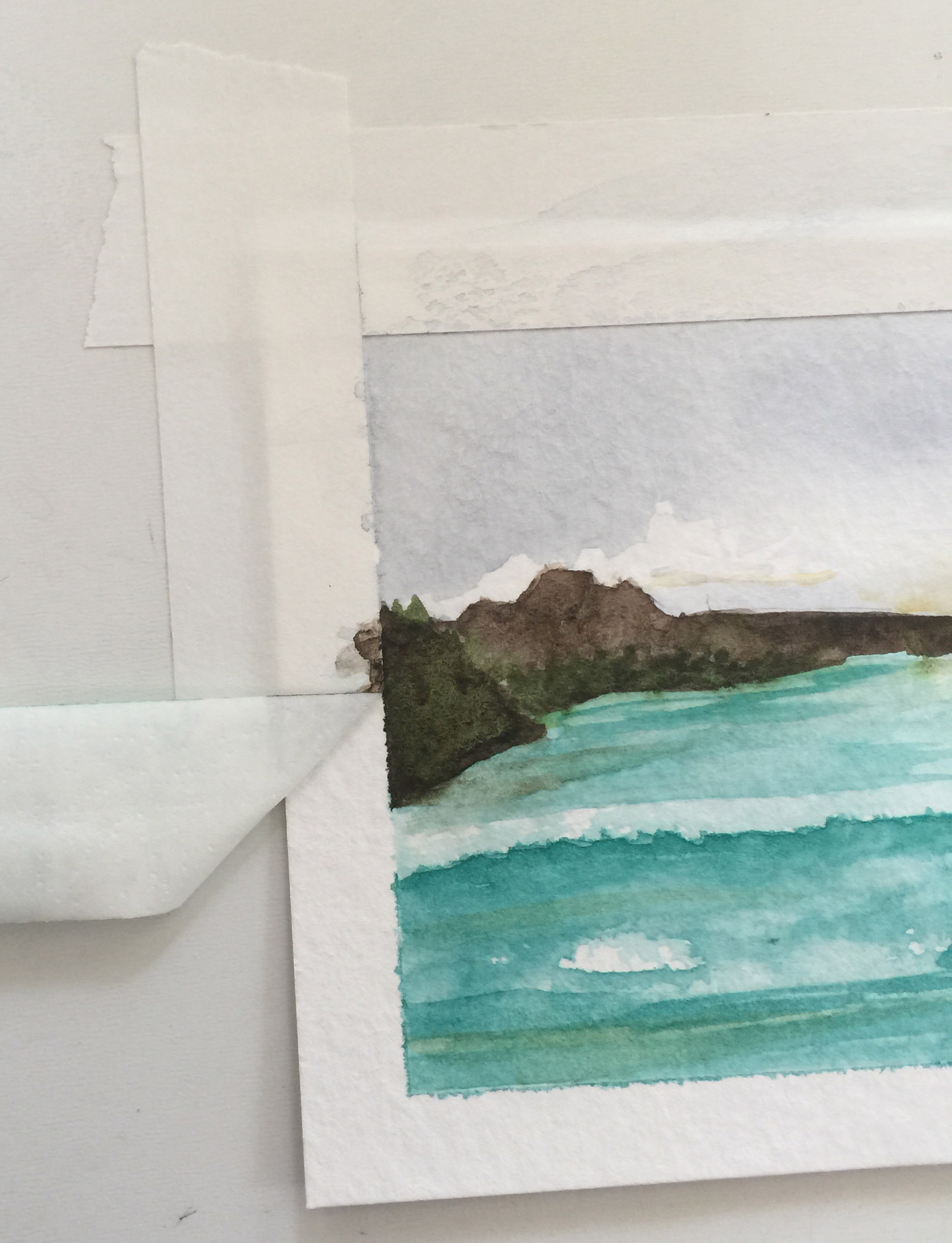
Taping your paper to the work area is a great way to get a really pretty white border around your painting. Put tape on going in a circle, not top, bottom, left, right, but top, left, bottom, right (starting anywhere, going either direction. Press the tape firmly against the paper, but keep it lighter on your work area for easier removal. When you remove the tape, remove it in reverse, pulling the tape close to the board and away from the paper at roughly a 45 - 90 degree angle.
Removing tape.
Without taping, no border. Pretty for floating frames, but traditional frames will cut off the sides of your painting.
From block paper (see the black residual glue on the edges of the paper). Soft, dynamic, blended out edge.
White edge from taping the paper. Notice the spots where the tape wasn't pressed down securely enough and the paint seeped under the tape giving a slight fuzz, especially along the bottom.
Tearing Sheet Paper (not block)
Tearing paper instead of cutting it to resize it smaller will give you that really pretty fuzzy watercolor paper edge. It's not something you "just do". There's a correct way to get that nice fuzzy edge.
Fold paper so the "front" of the paper is toward the inside. You should start the crease in the center of the fold and crease outward to the edges. You can gently use a bone folder to make a sharper crease if you want.
Reverse the fold.
Reverse the fold again.
Mark the back of the paper on both "new sheets" before tearing.
Tear carefully (in the air) by holding closely to the crease and making a small rip at the crease, and then holding the outside corners of the paper and gently pulling the paper apart along the crease.
Watercolor Blocks
Watercolor blocks have glue all the way around and it is unnecessary to tape or clip the paper.
To use a watercolor block, simply fold the cover over to the back, remove the "protection sheet" if your block had one (Arches comes with a black sheet that makes you panic that you accidentally bought black watercolor paper.), and paint. Wait for your paint to dry completely before separating the sheet.
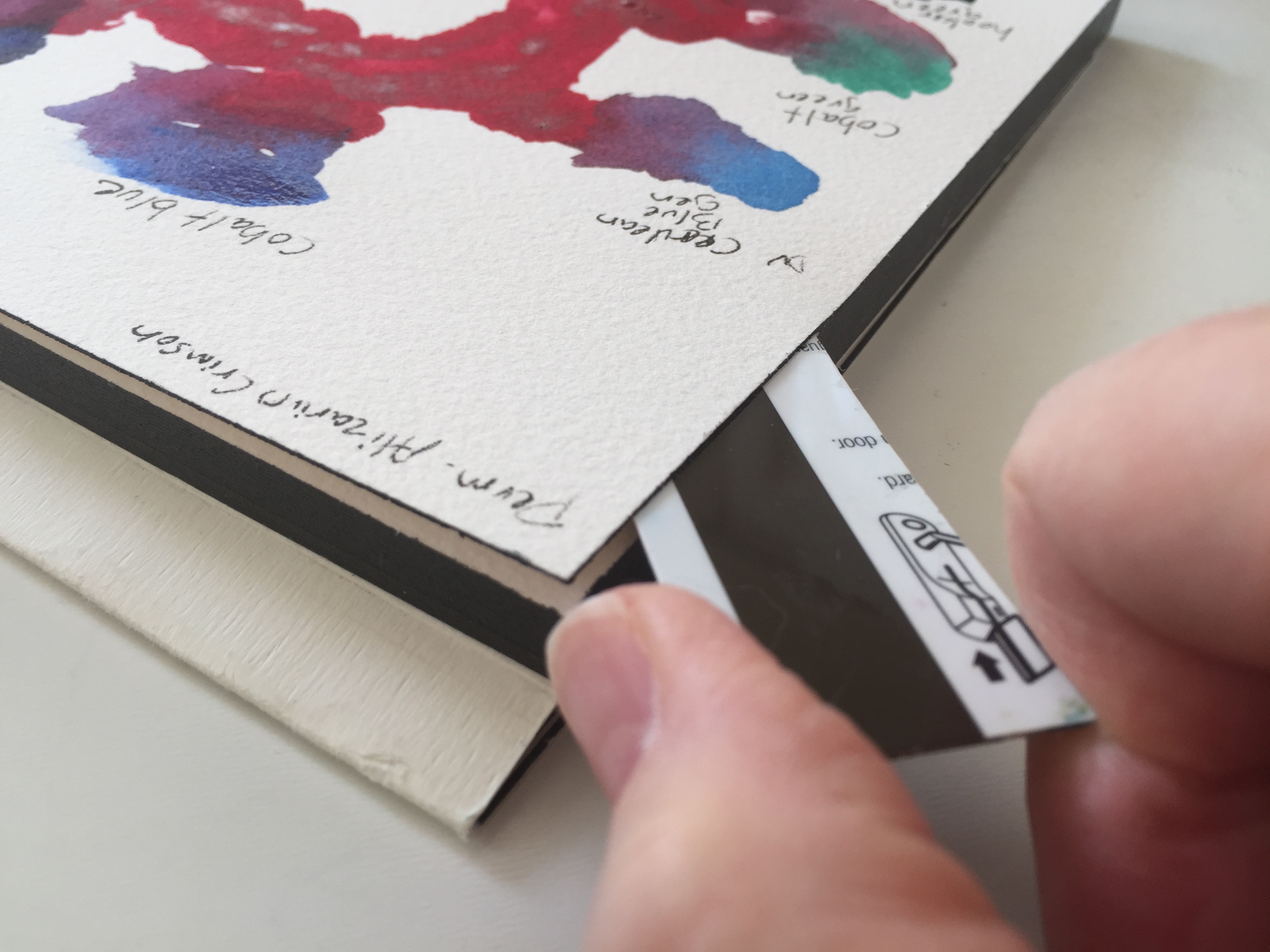
To remove the painted sheet from the watercolor block, locate the unsealed spot on the block.
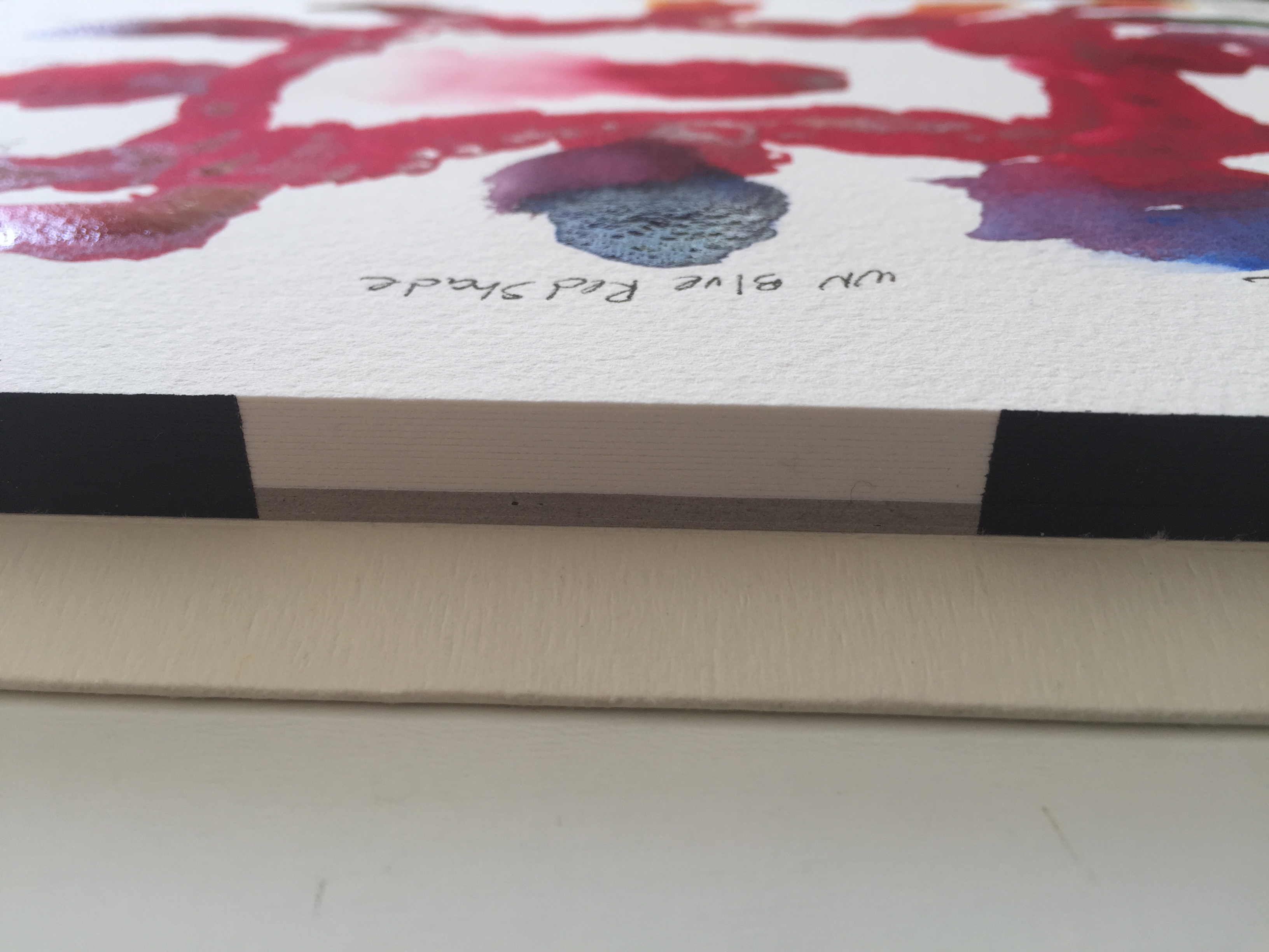
Insert your cut hotel room key or credit card.
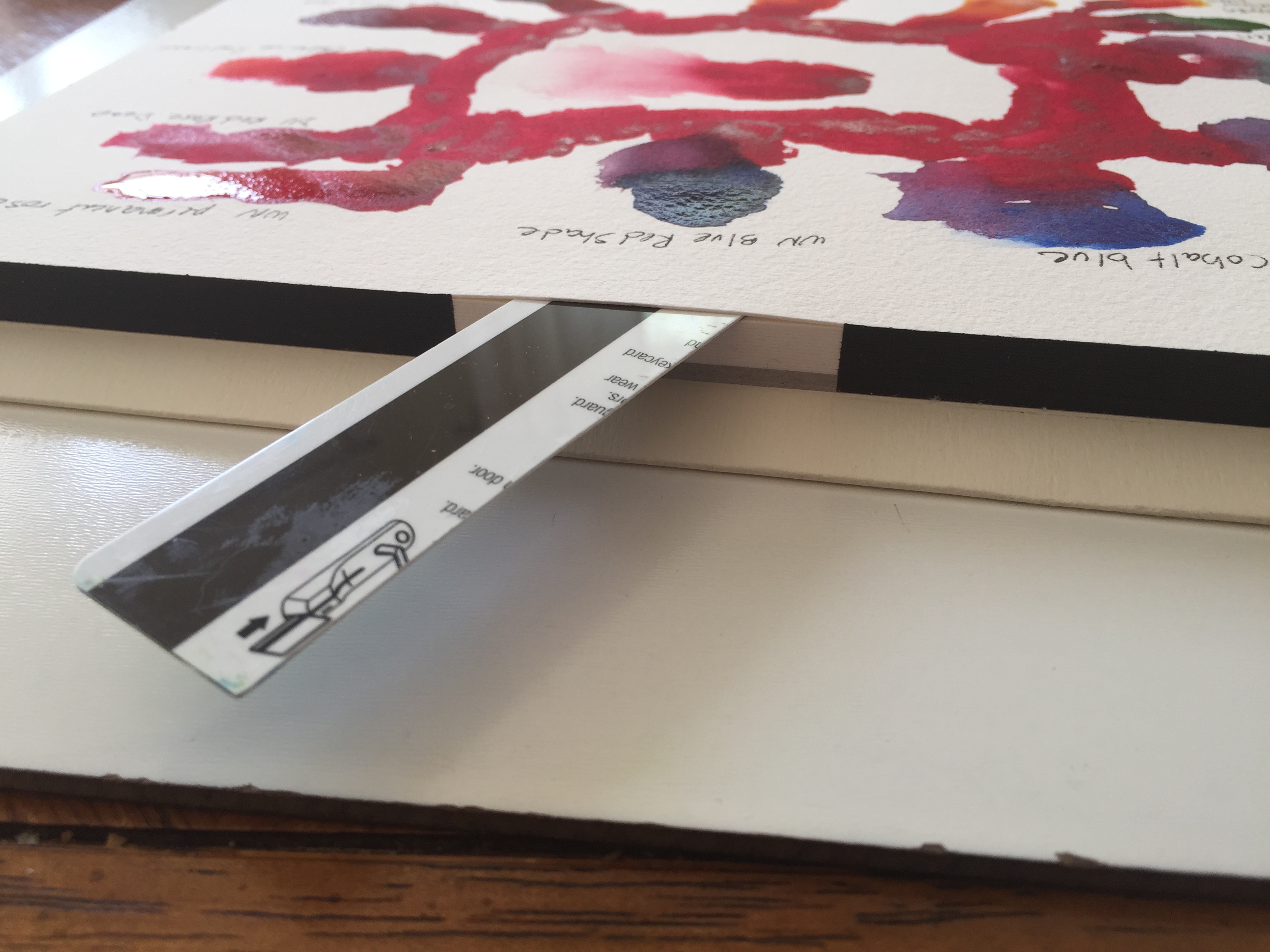
Carefully pull outward against the sealing-glue as you move around the block, being careful not to damage the paper underneath. See the angle of the key against the glue as you pull outward. In the picture below, I'm lifting the key so you can see the individual sheet. When you are actually "cutting" the glue, keep the key as flat as possible to prevent it from digging into the paper below.
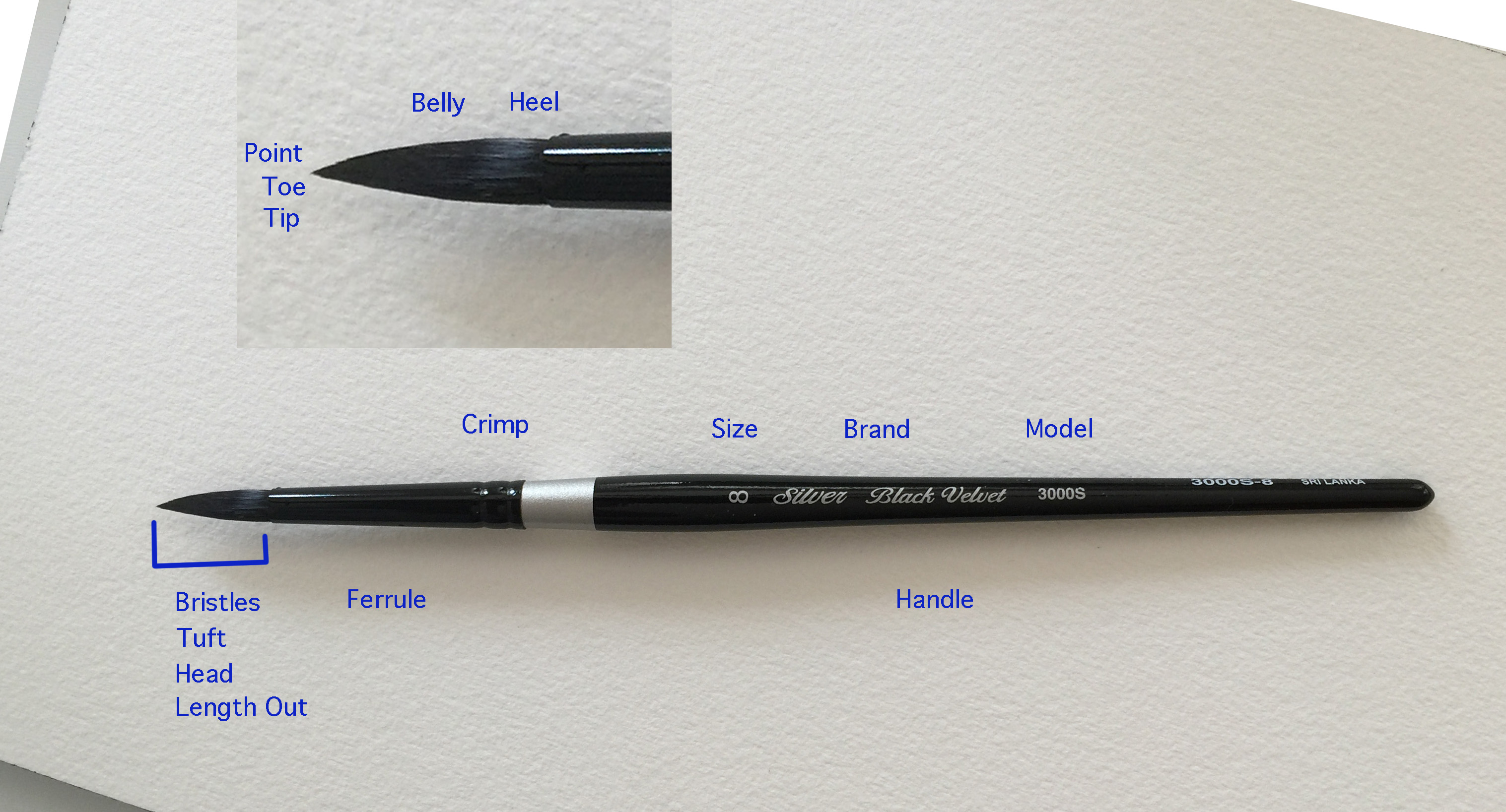
Brushes
Never, ever, ever set your brush in the water and leave it. The bristles will get damaged by the weight of the brush.
Do not store your brushes hair-side-up. This causes water and paint to move into the brush ferrule and can damage the heel of the brush. Lay them flat while you are working and for storage. You may also store them hair-down if you have a way that prevents the brush from resting on the brush hair. Ignore those little holes in the sides of some paint water basins; those are strictly decoration and shouldn't be used to set your brush in.
New brushes (good ones) usually come with gum arabic or some adhesive holding the brush shape. Soak the brush by dangling it in the water until it softens on its own, and then rinse it. Do not set the brush in the water and let it rest on the bristles.
Some brushes, particularly those of natural hair and the more expensive brushes, should be held in the basin water until they release their stiffness on their own, every single time you use them. Never force them to start bending or you risk breaking the bristles. These same brushes shouldn't be held directly under running faucet water because the water pressure might damage them. Instead, make a pool in your hand and rinse the brush against your hand, with the water flow slowed/gentled by hitting your hand first. (Beware toxic paint, like copper-based ones, and consider using a bowl instead of your hand if you've been using those.)
Brushes should be gently blotted to remove excess water, then carefully shaped, and air dried before storing them so they wont mildew.
Brushes should be stored in such a way that they will not slide and roll. If the storage bed pushes against the bristles due to sliding and rolling, it will damage them.
You can lightly cover bristles with gum arabic (like the manufacturers do before they ship them) to hold the bristle shape. You will need to soak them again before use.
Brushes should be dragged not pushed so it doesn't damage the tip.
Don't put your brush into the water above the top edge of the ferrule. Water gets inside the ferrule and can cause the wood to crack and split.
These exercises are designed to give you a clear understanding of the properties of your paints and give you a few simple brush strokes to get started. The first two may seem like a lot of tedious gruntwork that you could skip merely by printing some graphics from an internet search, but you will learn things while you do the exercises that you wont learn if you take a shortcut.
Watercolor Paint Card Deck
For this exercise, you will be creating a deck of cards - one card for each of your paints. You should use your "good paper" as these are a permanent tool to add to your art supplies. You will need them in later lessons. This is a great thing to do every time you get a new color so you will know where it belongs in your palette.
Read this all the way through before attempting your first card.
If you have never done wet-in-wet before, try it a few times on a test paper to see how much pigment to water you want to use on the water-wet (shimmering, not puddled) area. If you have never blended out your watercolor, you start with a thicker mix of paint and add water as you move across the paper; again, try it a few times on a test paper. It's OK if they aren't perfect. These techniques are covered in detail in a later lesson.
Steps
Cut or tear your paper down to approximately 2 1⁄2 by 1 1⁄2 inches (64 mm × 38 mm) cards. Make one for each color paint you have.
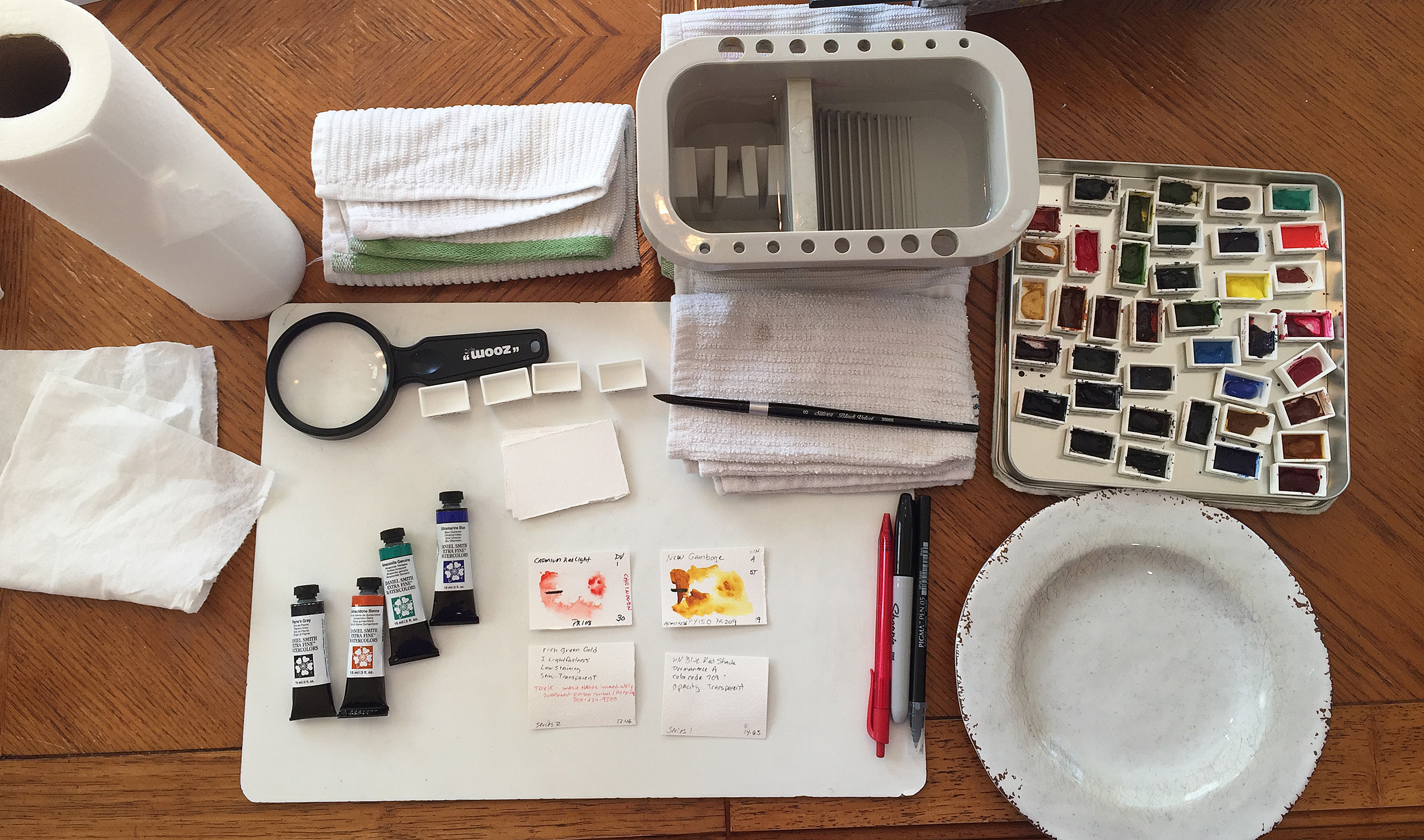
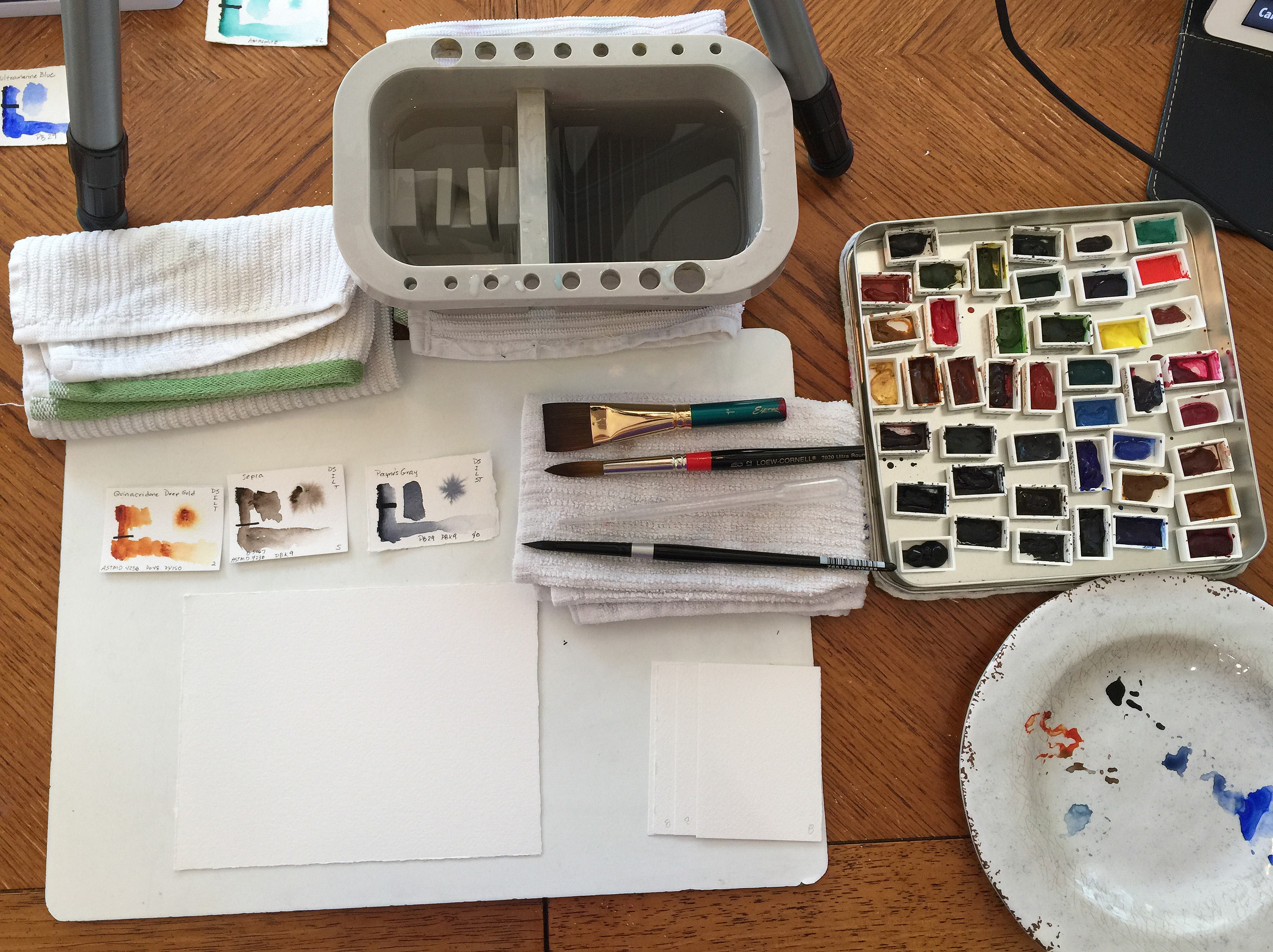
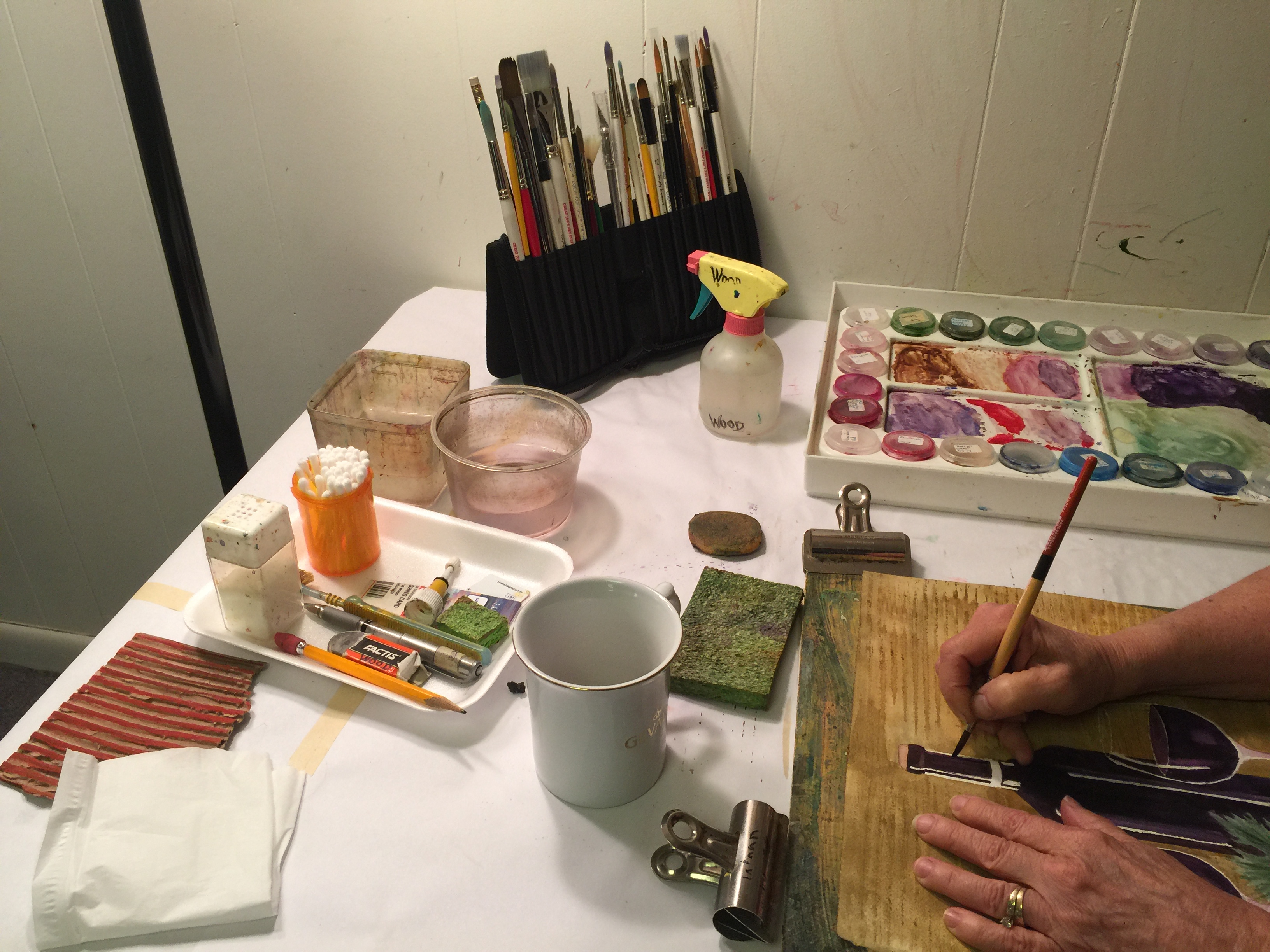
Set up your workspace. Here's a picture of mine with my 4 new paints and 4 sample cards (2 showing front, 2 showing back), using my travel setup instead of my studio setup with my big John Pike palette. Notice that the supplies and setup are what I have. These lessons are designed to let you work with what you have. Pictured are full pans (MEEDEN Empty Watercolor Paint Pans) with magnets (Magnetic Squares) cut to size and stuck to the undersides, and then set in an old prismacolor color pencil tin. The magnets keep them from sliding around, and I always keep the same colors in the same place, organized with a logic that suits my own personal workflow. That's a cheap plastic plate and the water basin I link In the Efficiency Supplies section. My dirty water is always on the right and my clean water is always on the left.
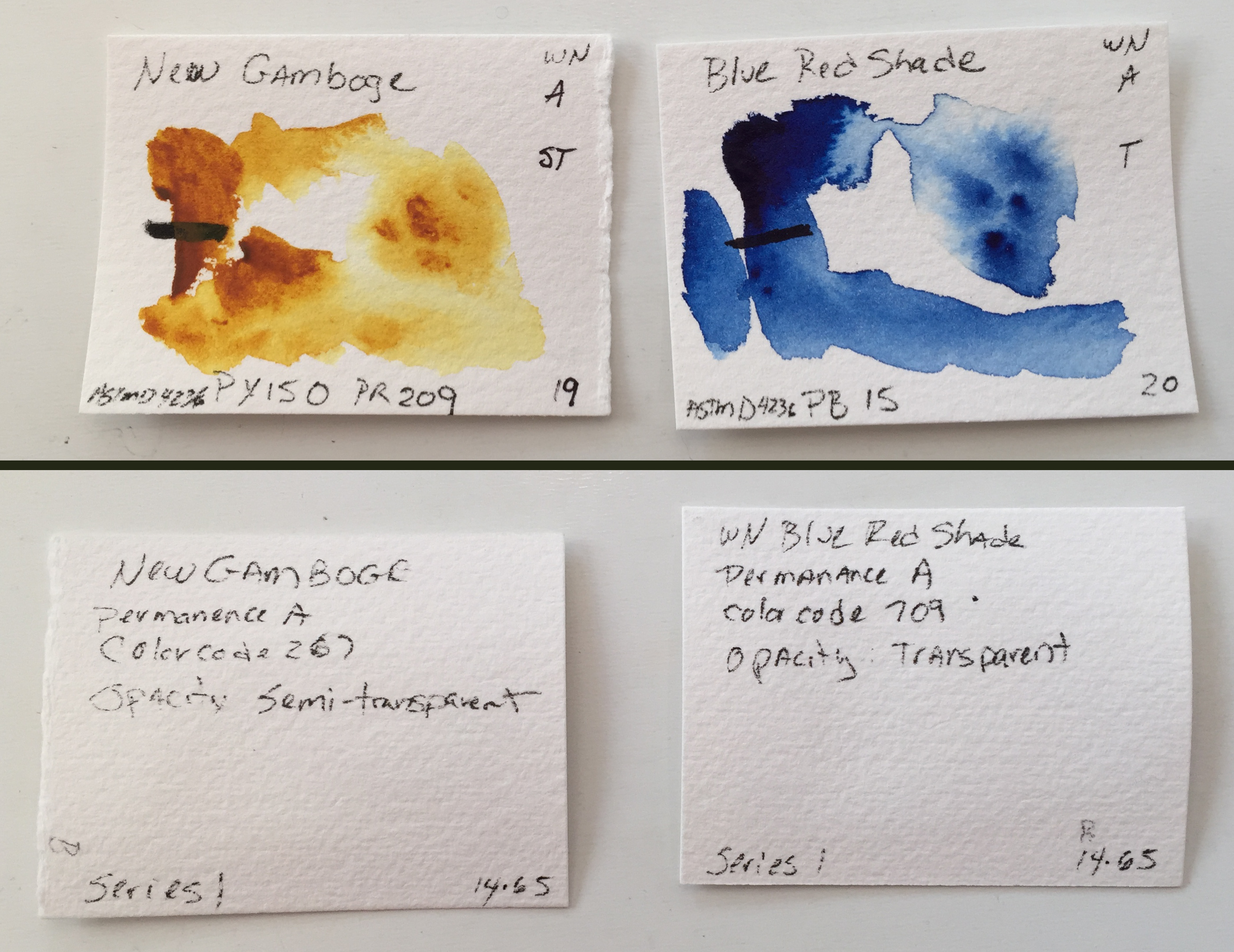
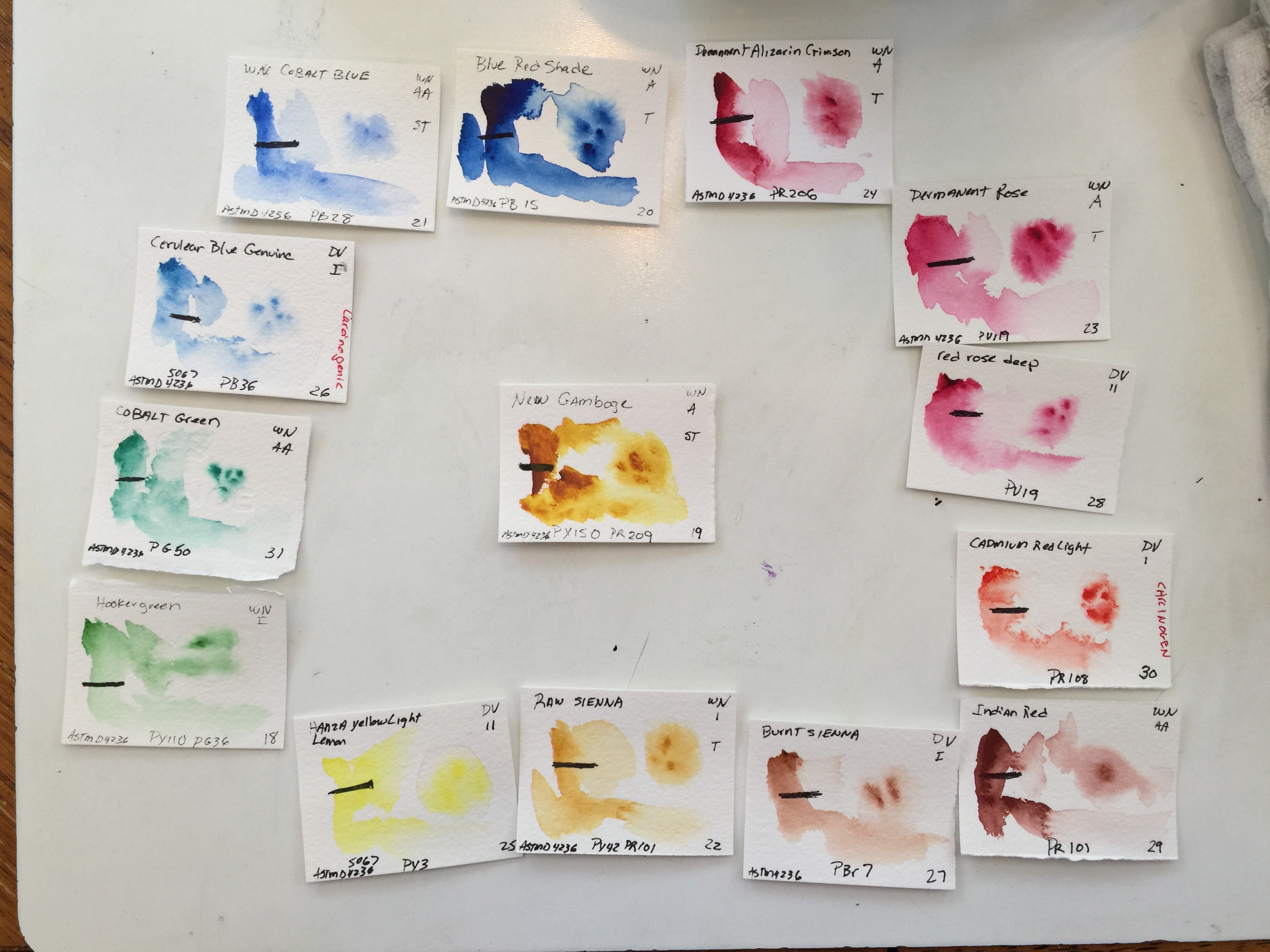
Use your pens to write information on both sides. This information can be found on the tube of your paint or on an internet search. Look up any term you do not understand. Some of my cards are missing information; don't be like me. Look it up on the Internet if it isn't on the tube. The astute people will notice that I even include the phone number for poison control on that Rich Green Gold card, because swallowing it is a hospital visit.
Front
Back
Front:
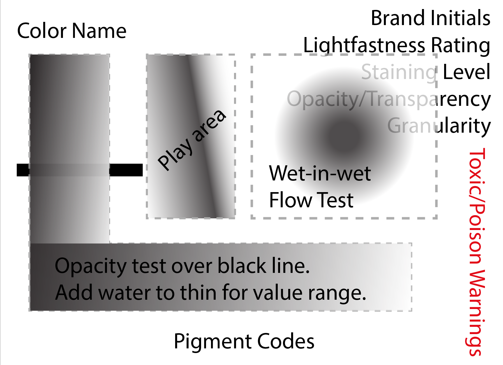
Top left - the color name spelled out.
Bottom center - pigment codes (examples: PW5 PB6 PBk 9)
Top right - abbreviation for brand (example: WN for Winsor & Newton), lightfastness rating (varies by brand, but basically I, II, III, IV), staining/medium staining/nonstaining (S or M or NS), opaque/semi-transparent/transparent (O, ST, T), granularity (G if granular).
Bottom right - if the paint is carcinogenic or poisonous, write that in red, sideways.
Left center - a black line made with a permanent black marker. Let it dry completely.
Back:
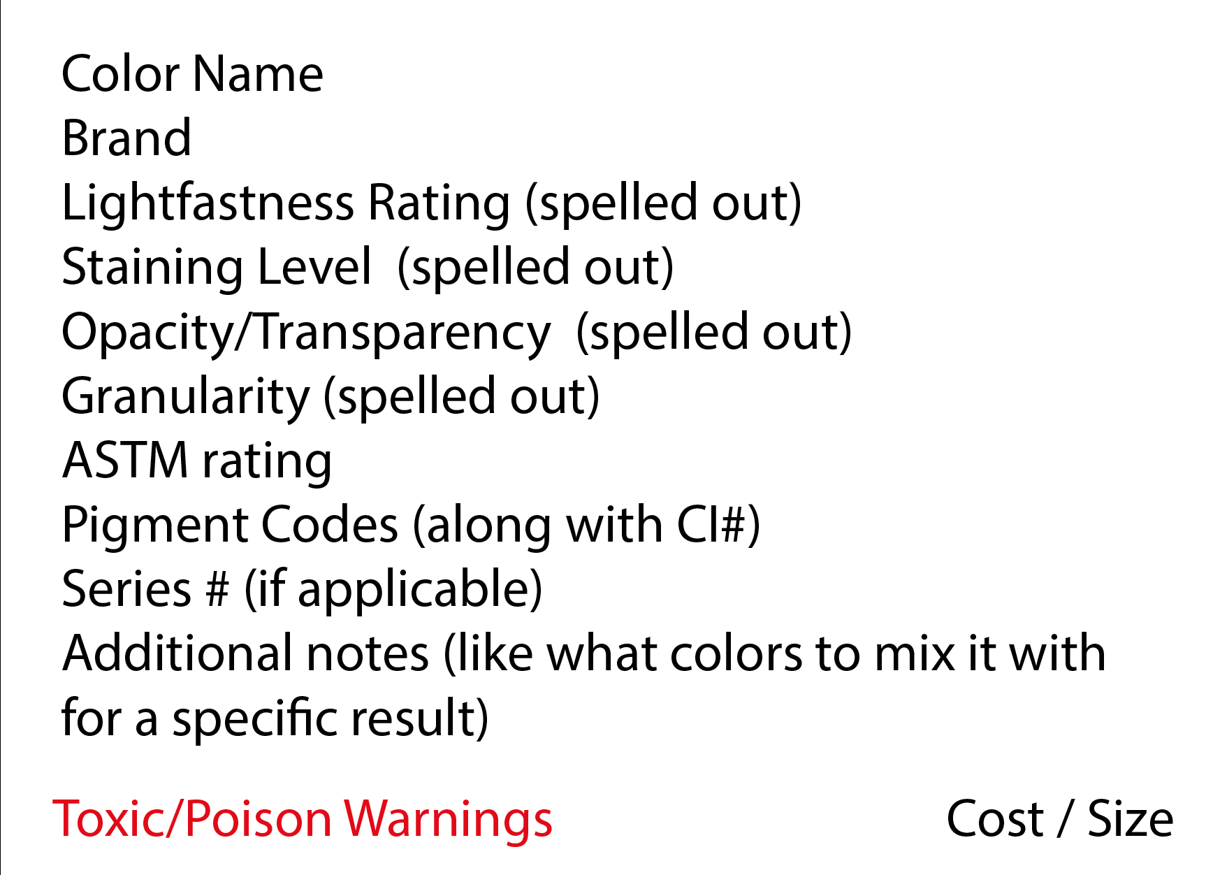
Top left -
Color Name
Brand
Lightfastness Rating (spelled out)
Staining Level (spelled out)
Opacity/Transparency (spelled out)
Granularity (spelled out)
ASTM rating
Pigment Codes (along with CI#)
Series # (if applicable)
Additional notes (like what colors to mix it with for a specific result)
Bottom left - in Red, any toxic/poison warnings.
Bottom right - cost/size that you paid
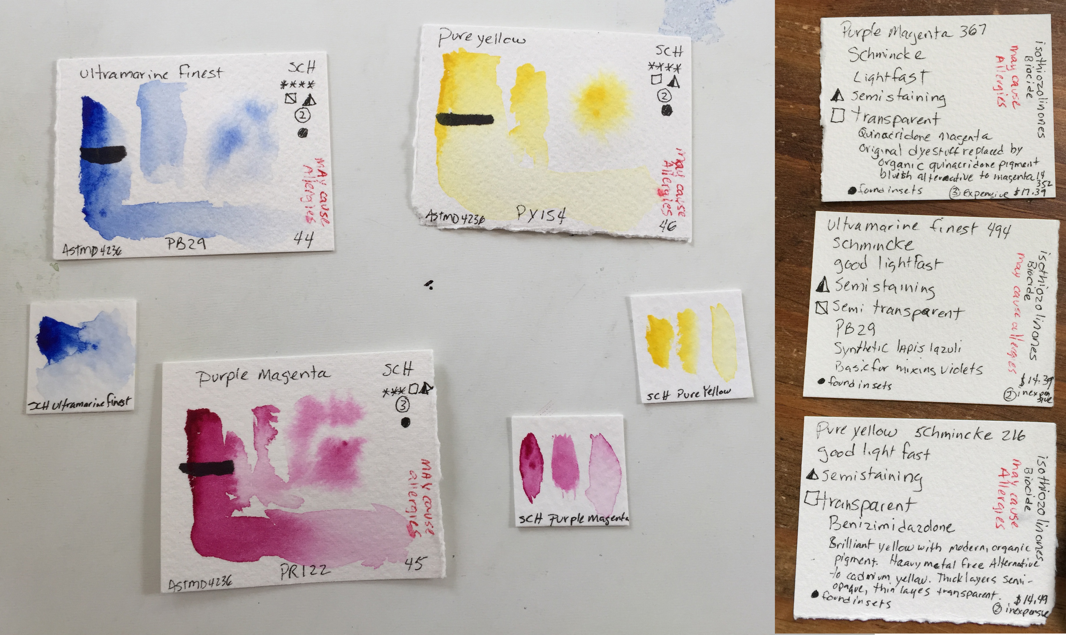
Schmincke Horadam cards. Notice that the information is slightly different to match the information style for this brand.
When you have all the information written out, it's time to paint them.
Wet a square on the top right (not over your writing) with clean water. This area should be shimmery, but not puddled. You might have to go over it a couple times.
With your clean, damp pointy brush, take the tiniest bit of paint directly from the tube. This is done to get the maximum density of pigment. For an actual painting, you will want to have some squeezed into the well of your palette, and work with it watered down to varying degrees so it flows on the paper.
At the left top of your card just under the color name, paint a tiny circle nice and thick, spread that thickness in a thin line down over the black line you drew. Add a tiny bit of water to your brush and mix the remaining pigment on your palette and use that to blend out to the right. You may need to add a little pigment or a little water depending on how much paint you used. Blend your color out over the L shape such that the darkest/thickest pigment is on the left and the lightest is on the right. About half-way across the bottom of the L, you should only add clear water with a clean brush as you blend out to the right.
If your wet-in-wet area has dried past shimmering, rewet it with a clean brush and clean water. With an evenly mixed bit of water/paint on your brush, touch the center of the shimmering, non-puddled area, immediately lift your brush off the paper, and watch how the paint behaves.
Use the remaining mix on your palette in the "play area", but be careful not to touch your wet-in-wet flow test.
When your cards are finished drying, have a container or a baggie to store them in when you aren't using them.
Here's video showing how to paint the cards.
Make yourself a swatch sheet too. I like my swatches to be on little movable taped-down cards on a sheet of paper that I keep in a plastic sheet protector, but you can paint directly on paper. Each swatch should have the color name and be painted with a full range of dark to watered down light. Group similar colors together. The outside edge in my swatch sheet exactly matches the color wells in my John Pike palette.

Practice and Observe
Which of your paints flowed the most across the wet-in-wet area? Which were the easiest to blend out? Do you have any that have granularity (little specs of concentrated pigment)?
What benefit do you see for these over a swatch sheet with all the colors on the same page? What benefit would a swatch sheet have over these?
Studies
http://www.winsornewton.com/na/discover/resources/composition-permanence
http://www.artiscreation.com/Color_index_names.html#.WujVg2aZPdS
https://www.youtube.com/watch?v=F8aVfqDKx1U
Research Questions
What is the ASTM rating?
What do the pigment codes mean?
How important is lightfastness to you?
Puzzle
Give serious thought to the puzzles and try to figure them out before looking at the solutions at the end of the lesson.
What do the different paint areas on the card tell you?
Mix Reference Sheets
Use the colors and paints you have, not these specific colors.
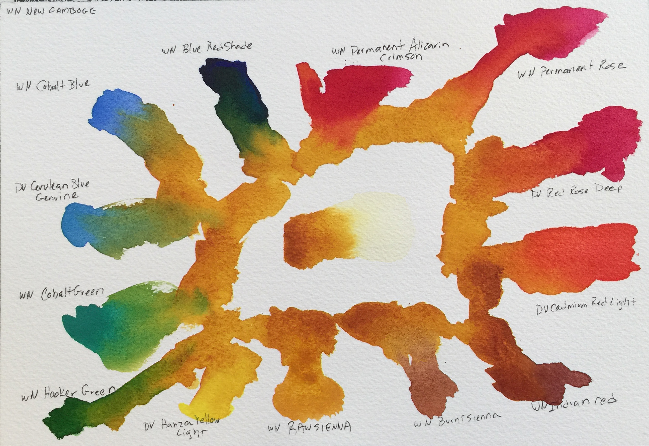
For this exercise, you will learn how to create a reference sheet for mixed colors. You should use all your colors. I used a subset of mine (on account of my paint-buying addiction) that has all the core colors I listed in that section under supplies and a couple more for variety.
Read this all the way through before starting.
Steps
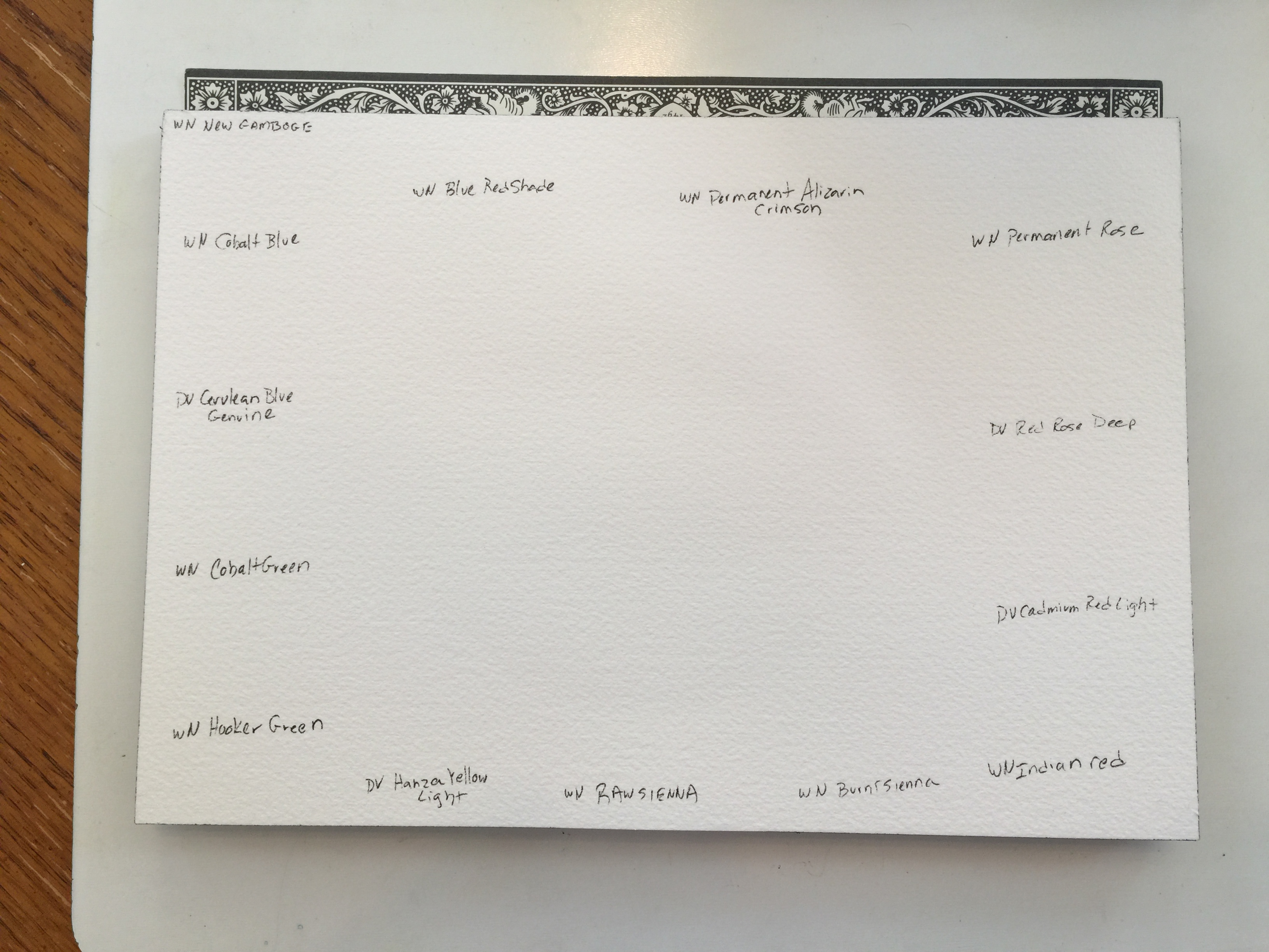
Set up your workspace.
Arrange your paint deck around one color in the order of the rainbow (purple, blue, green, yellow orange, red). I'm using WN New Gamboge as my core color. Choose any red, blue, or yellow to be the center.
That will tell you how much space you have to work with for each color and will help you decide what size paper you need to use.
Write the colors on your paper in roughly the same locations.
Mix on your paper, not on your palette. The center contains your main color choice, and each color gets blended with that color. Use your rounded tip brush. Change your rinsing water as often as you need to.
Here's video showing how to paint your reference sheet.
Practice and Observe
Did you have any paints that immediately tried to take over (like my Indian Red did)? Were there any combinations you particularly liked (if so, add notes on the back of your color cards)?
Do you think you might find value in a recipe deck to go with your paint deck?
How often did you have to go back to your palette to get more paint to make the right size area? What does this say about the size brush you need for a particular task?
Could the process have been done more efficiently with 2 brushes?
Did you notice any areas of more water flowing into areas with less water?
Studies
Watch these AFTER you have completed this exercise to get the most value out of viewing.
https://www.youtube.com/watch?v=qAj17pIprf4 - He is using 300lb paper, so he has more time to go over the wet areas because they dry much slower (like when he goes back with his cobalt blue around 2:54). Notice particularly how he dual-loads his brush and rarely "cleans" his brush. The multiple colors on your brush add life and variety to your paintings so they wont look flat.
https://www.youtube.com/watch?v=LB_BCB0Cl0w - Her green-browns are gorgeous with a new combination of paint on every stroke. That will help your paintings look professional and is useful even with a larger brush.
https://youtu.be/DVS7tfnBRT4?t=1m50s - This is the best demonstration of shifting colors back and forth that I've seen.
Research Questions
What does this exercise tell you about the color wheel?
Puzzles
Give serious thought to the puzzles and try to figure them out before looking at the solutions at the end of the lesson.
What colors would you mix to so that you have every color in the rainbow if you don't already have them?
How often should you change your rinsing water?
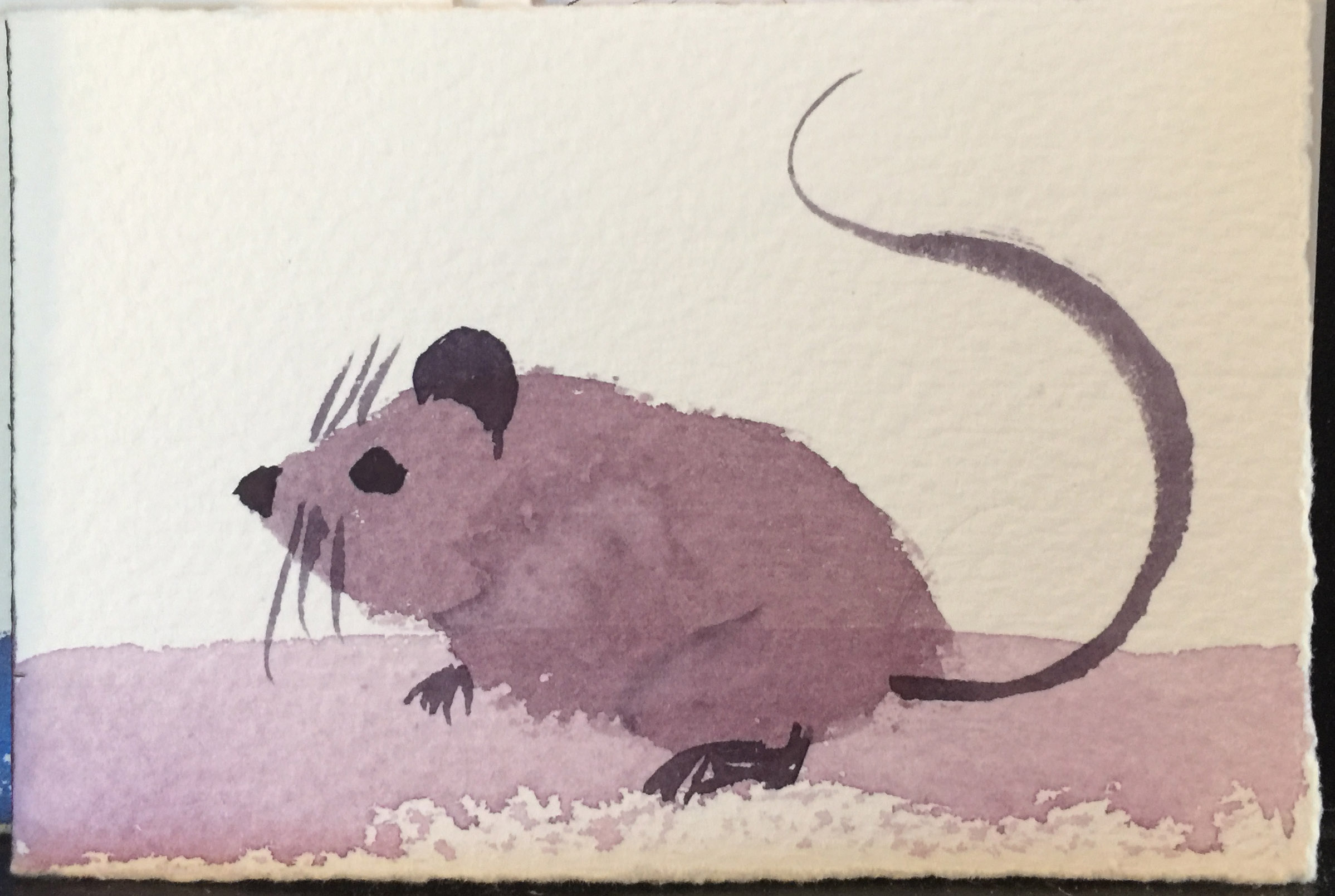
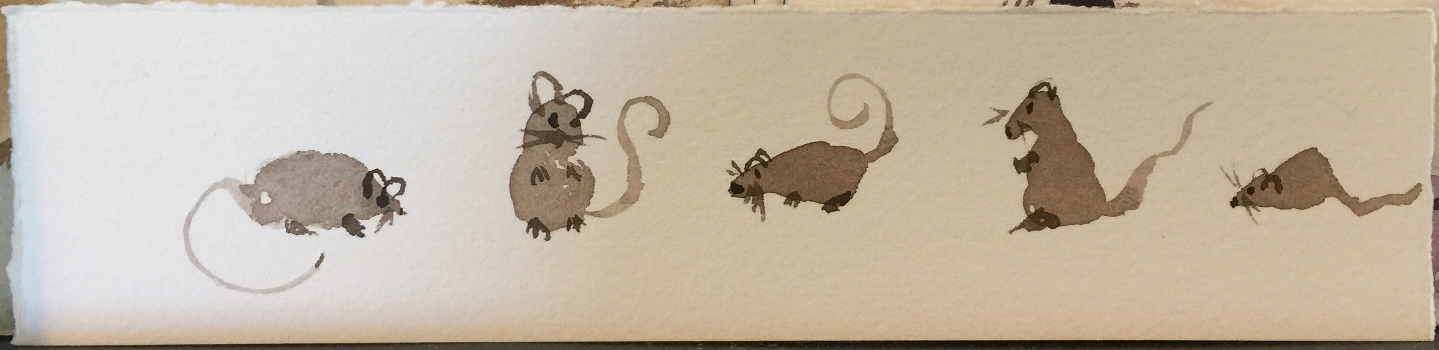
Mouse on Art Card
For this exercise, you will be creating art cards with mice on them.
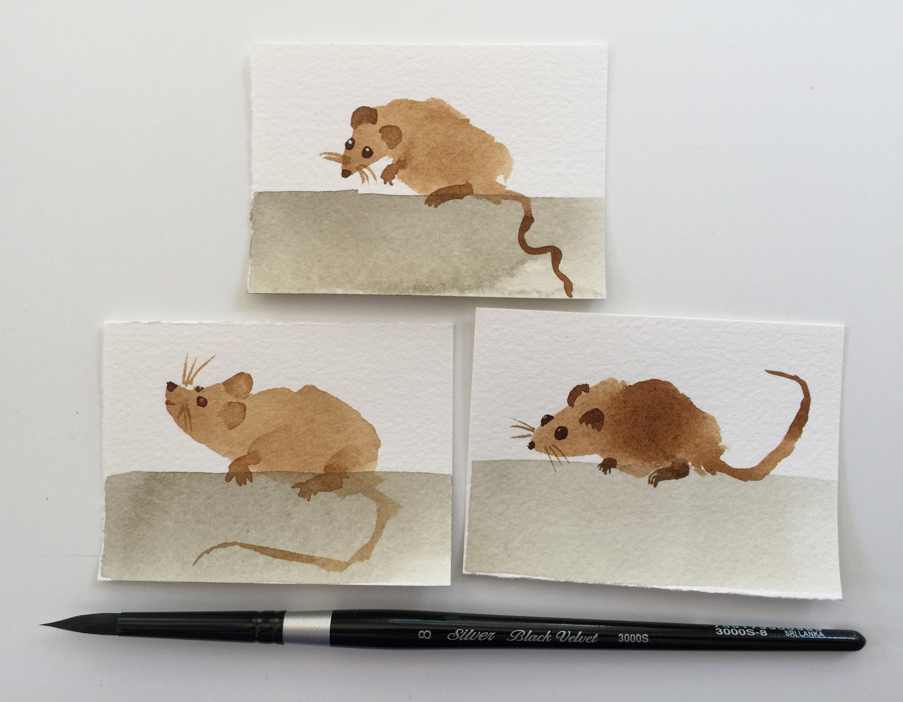
Steps
Cut or tear your paper down to 2 1⁄2 by 3 1⁄2 inches (64 mm × 89 mm) cards. Make at least 4.
Set up your workspace. Here's mine. Notice the convenient practice paper and how easy the paint cards make it to find pleasing color combinations. Paintings look more natural with a limited color selection (2-3, with maybe a 4th color used strictly as a small accent).
Make 2 mixes of a nice color on your palette. One should be watery, and one should be thicker. Use the watery one for the head/body and the tail, and the thicker one for the details. You'll notice that I rarely specify exact color and paint for these exercises. That's because some people like chocolate cake and some people like vanilla cake and some people only have fruitcakes. You have your paints. The previous two exercises gave you a good feel for what you have and how those paints flow. If you want a purple mouse, make a purple mouse. I show the colors I use with my swatch cards for the people who want to know, but you never need to use those exact ones.
Use the mop or flat brush to paint a ground from the bottom of the art card to about 1/3rd of the way up.
Wait for it to dry completely. If the paper is cool to the touch, it is still wet. You can use a hair dryer if you want.
Use your non-pointy round brush to create a mouse-shape head/body with one stroke, above the ground, so he will be sitting on the ground. Use one stroke for both the head and body by pressing the brush tip down at an angle to create a pointy area for the head and then pulling the brush into a circle for the body. Do not go back over the area a second time to refine the shape or touch the body with more paint.
Wait for it to dry completely. If the paper is cool to the touch, it is still wet. You can use a hair dryer if you want.
Use your fine point brush, with thick, saturated paint (almost no water) to add eyes, ears, whiskers, feet. Each part should be one stroke. Do not go back over anything
With with slightly more water, use one stroke of the fine point brush to create a tail.
Here's video showing how to paint the mouse art cards.
Practice and Observe
Try some strokes with clean-water only on the Original Buddha Board if you have one, or on a practice page with your watercolors. The mouse head/body can be tricky to get with one stroke (and truly, it took me about 30 on the buddha board to get some I actually liked), but you do not want to "apply more paint because you didn't have enough" or "paint to change the shape because you didn't get it right the first time". Sometimes you'll need or want to, but you shouldn't become dependent on multiple strokes; it's a bad habit that might result in your painting looking "overworked and amateur" as you do more paintings. The single stroke allows the pigments to settle into the paper where they fall, which is absolutely critical if you are semi-mixing paints to get elements of both colors into your painting (over-mixed colors is sometimes referred to as "making mud" for the flat result, often a grayish bland).
Notice how much water you mix with the paint and how much of that you put on the brush to get the result you want. If the water sits on top of the paper as it dries, rather than soaking in, the pigments will float a little to the outside edge and dry with a darker edge-line.
Notice how the brush sits and moves on the paper, and how much or how little it snaps back into its original shape when you lift it from the paper.
Do you have a brush in your collection that would work better for the mouse head and body (maybe a mop or the Silver Black Velvet Oval Wash? If you have a fan brush, try making the mouse head and body with that.
Could you make the mouse easier if you hold your brush differently?
Studies
https://www.youtube.com/watch?v=ivjav8FPfrE - notice how Coco Bee uses her brush, the angles she holds it, how she uses both the tip and the side of her brush and turns it as she paints, and how much the pressure she applies to the brush varies. See the "bubble" of paint and pigment that is left behind when she lifts her brush off the page. She doesn't go back into the area to fix things, but only to deliberately alter them by letting the paint flow into the new strokes or mix with the new stroke's colors.
Puzzles
Give serious thought to the puzzles and try to figure them out before looking at the solutions at the end of the lesson. Try a few things. Often you will see an effect in someone's painting and wonder how they did it. This will teach you how to analyze the techniques and steps used in other paintings.
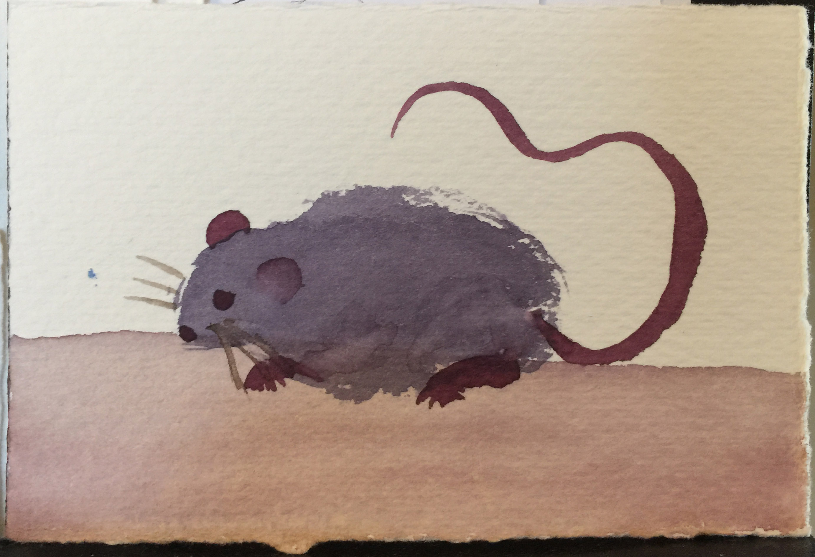
How might you give the mouse the appearance of fur on his back like in this image?
How might you get multiple tones on the mouse like in this image?
Random Gallery: Mice and Workspaces
- Paint deck - one card for each paint color in your inventory
- Swatch sheet - should have every paint color in your inventory
- 2 pages of mix reference sheets (with red, blue, or yellow centers - doesn't have to be primary colors, but should be in that general hue range, don't use the same hue (i.e. don't do 2 reds))
- 1 page of practice mice and grounds
- 4 artist trading cards (mouse)
Just like with drawing, you can paint with your hand, wrist, elbow, and shoulder. If you haven't ever heard about this before: https://youtu.be/pMC0Cx3Uk84?t=2m6s - until he starts talking about the overhand grip. Grip your brush lightly and paint with the part of your anatomy that works best for what you are trying to accomplish.
Pay attention to your posture as you work to avoid wrist, shoulder, and back pain. https://www.youtube.com/watch?v=svFJjn8l2ko
How to Store your Supplies
Always empty and rinse your water basins and store them empty to prevent algae and mildew.
Paper needs to be protected from sunlight and moisture in the air and needs to be stored in a way that wont let it get bent or creased.
How to Train your Cat
No one has ever succeeded in training a cat. You must take precautions.
Brushes should be protected from chew-happy cats that somehow walk through your work area no matter how many times you tell them not to.
Do not let your cat drink your paint water. They always think it tastes better than their water bowl water, and it can be toxic.
You can remove cat hair (or watercolor brush hair) from wet paint with a pin, although sometimes it's better to let it dry and pick it out after it's dry. You might get a line or smudge from the hair in either instance.
Making your own brushes may look easy, but it isn't. Your furry friend doesn't appreciate you eyeing his/her tail for brush making supplies.
Paint Deck Card: What do the painted areas tell you?
The paint over the black line shows you how opaque (hides the black line) or transparent (black line is visible and the color is not).
The blended out areas show how much granularity (small specks) is in a paint as well as how easy it is to work with, as well as how much pigment you're going to need to get the color you want.
The wet-in-wet area shows how the paint will flow across wet paper. Some spider-tendril out almost immediately while others will just sit in the center and hardly move at all.
Mixing Colors: Recipes for a Rainbow
Red + Blue = Purple
Blue + Yellow = Green
Red + Yellow = Orange
This should look surprisingly familiar to something from grade school. There are obvious nuances for specific paint colors, but those will help you look at the right hues.
Mixing Colors: Changing your Rinse Water
When I was first learning, I changed my rinse water often and cringed watching videos when the artist's water was darker than black coffee. Reasons to change your rinse water: if the brush cannot be lightly dried with the paper towel or hand towel still mostly clean, change your water; if you are swapping from heavily working in one hue to another (like red to yellow to blue), change your water; if you get any medium in your rinse water (masking fluid, gum arabic, etc.), change your water; if you use something other than watercolor (ink, gouache, etc.), change your water. If you are waiting for your paint to dry, and are tempted to paint more anyway, change your water (and tidy up your work area, and go for a walk, and call a friend and talk, or anything to NOT mess up your painting). You will find your own happy water-swap time with experience.
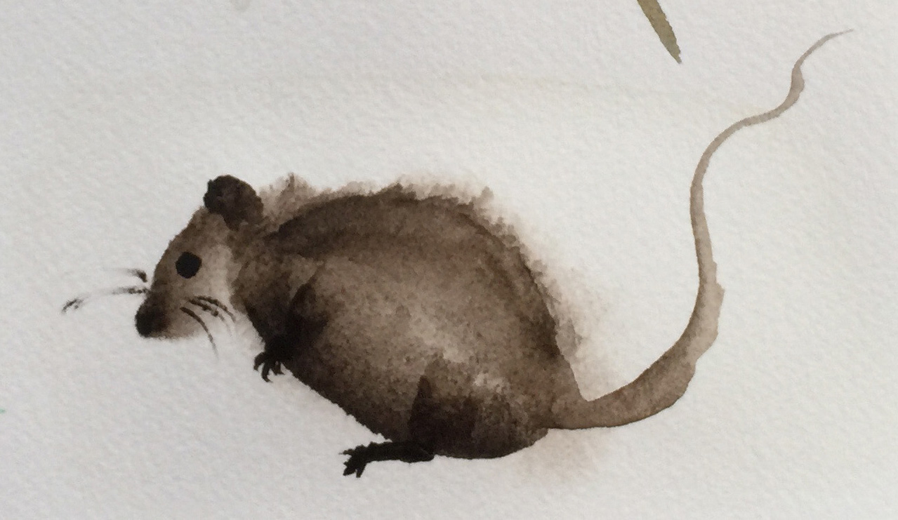
Mouse Art Card: Making fur.
Try all of the solutions.
First solution - While making the head and body stroke, change the tilt of the brush and squiggle in some fur, and extend the body stroke with a loop to cover the inside of the squiggle. This will create thick fur that will be hard to make pointy, even using your sharply pointed brush.
Second solution - After you paint the head/body stroke, take your sharp point brush, clean and damp with water, but completely squeezed and blotted of any excess water and very carefully pull out fir from the very edge of the body. This violates the "single stroke" directive, but points out that it's ultimately your watercolor art and you can do what you want to achieve the effect you want.
Best solution - Paint an arc twice as wide as your paint brush with clear water where the edge of the back will be, such that the watered area will be just barely touching his back and mostly outside of his back. Wait a moment for the water to soak into the paper and become "shimmery damp, but not puddle-wet". When you make the mouse's head/body stroke, barely let just a few hairs of your brush touch the wet area as you paint. The paint will suck into the wet area and give a furry effect. You may want to very lightly pre-draw where the mouse back will be with pencil before wetting the area or look at your paper at a sharp angle to see the wet area as you paint. You'll have to wait a little longer for it to dry, making sure the pre-wet area is also dry, before continuing.
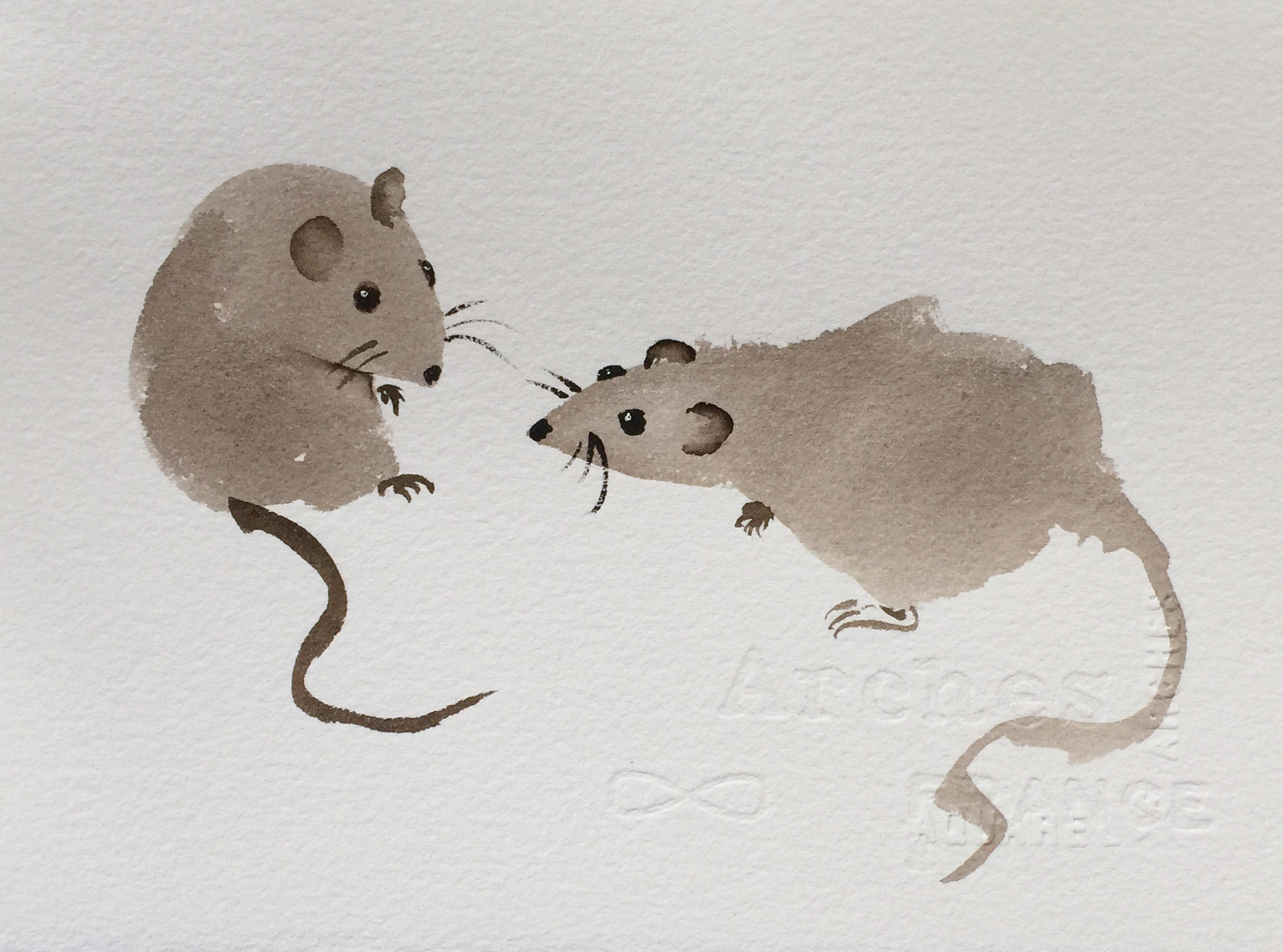
Mouse Art Card: Multiple colors and tones.
First solution - Go over the mouse with another color and lighter touch while he is wet, dropping in additional color. Colors will blend. This violates the "single stroke" directive, but points out that it's ultimately your watercolor art and you can do what you want to achieve the effect you want.
Second solution - Wait for the mouse to completely dry, and then glaze over the mouse with a lighter touch (use transparent or semi-transparent watercolor paint for the best effect), and soften the edge on the body so a nice gradient is created. This violates the "single stroke" directive, but points out that it's ultimately your watercolor art and you can do what you want to achieve the effect you want.
Best solution - Before making the stroke, load the brush with multiple colors or paint values, using three steps - put color 1 on one side of the brush, color 2 on the other side of the brush, and the "head" color on the tip of the brush. Then make the stroke. You may need to twist the brush as you paint to get the colors to go where you want them.
What else could you create using these techniques?